| Type: | Package |
| Title: | Data Sets from the History of Statistics and Data Visualization |
| Version: | 1.0.0 |
| Date: | 2025-11-25 |
| Maintainer: | Michael Friendly <friendly@yorku.ca> |
| Description: | The 'HistData' package provides a collection of small data sets that are interesting and important in the history of statistics and data visualization. The goal of the package is to make these available, both for instructional use and for historical research. Some of these present interesting challenges for graphics or analysis in R. |
| Depends: | R (≥ 4.1.0) |
| Suggests: | gtools, KernSmooth, maps, ggplot2, dplyr, scales, proto, grid, reshape, plyr, lattice, jpeg, car, gplots, sp, heplots, knitr, rmarkdown, effects, lubridate, gridExtra, vcd, MASS, forcats |
| License: | GPL-2 | GPL-3 [expanded from: GPL] |
| LazyLoad: | yes |
| LazyData: | yes |
| VignetteBuilder: | knitr |
| Language: | en-US |
| RoxygenNote: | 7.3.3 |
| Encoding: | UTF-8 |
| BugReports: | https://github.com/friendly/HistData/issues |
| URL: | https://friendly.github.io/HistData/ |
| NeedsCompilation: | no |
| Packaged: | 2025-11-30 16:34:49 UTC; friendly |
| Author: | Michael Friendly  [aut, cre],
Stephane Dray
[aut],
Peter Li [aut],
David Bellhouse [aut],
Hadley Wickham [ctb],
James Hanley [ctb],
Dennis Murphy [ctb],
Luiz Droubi [ctb],
James Riley [ctb],
Antoine de Falguerolles [ctb],
Monique Graf [ctb],
Neville Verlander [ctb],
Brian Clair [ctb],
Jim Oeppen [ctb],
Ivan Lokhov [ctb],
John Russell [ctb]
[aut, cre],
Stephane Dray
[aut],
Peter Li [aut],
David Bellhouse [aut],
Hadley Wickham [ctb],
James Hanley [ctb],
Dennis Murphy [ctb],
Luiz Droubi [ctb],
James Riley [ctb],
Antoine de Falguerolles [ctb],
Monique Graf [ctb],
Neville Verlander [ctb],
Brian Clair [ctb],
Jim Oeppen [ctb],
Ivan Lokhov [ctb],
John Russell [ctb] |
| Repository: | CRAN |
| Date/Publication: | 2025-11-30 17:20:02 UTC |
Data sets from the History of Statistics and Data Visualization
Description
The HistData package provides a collection of data sets that are interesting and important in the history of statistics and data visualization. The goal of the package is to make these available, for instructional use, for historical research, or just plain fun—the challenge of taking dusty old data and using your modern statistical an graphical prowess to find something new or show off your skills.
Details
Some of the data sets contained here have examples which reproduce an historical graph or analysis. These are meant mainly as simple starters for more extensive re-analysis or graphical elaboration. Some of these present graphical challenges to reproduce in R and I'm pleased that some of these have been featured in social media calls for participation, such as the 30 Day Chart Challenge, https://github.com/30DayChartChallenge/Edition2025
They are part of a program of research called statistical historiography, meaning the use of statistical methods to study problems and questions in the history of statistics and graphics. A main aspect of this is the increased understanding of historical problems in science and data analysis trough the process of trying to reproduce a graph or analysis using modern methods. I call this "Re-visioning", meaning to see again, hopefully in a new light.
A number of these are illustrated in our book, Friendly & Wainer (2021), A History of Data Visualization and Graphic Communication, and some are re-produced in R in the companion web site, https://friendly.github.io/HistDataVis/.
Descriptions of each "DataSet" can be found using help(DataSet);
example(DataSet) will likely show applications similar to the
historical use.
Data sets included in the HistData package are:
ArbuthnotArbuthnot's data on male and female birth ratios in London from 1629-1710
ArmadaThe Spanish Armada
BowleyBowley's data on values of British and Irish trade, 1855-1899
BreslauHalley's Breslau Life Table
CavendishCavendish's 1798 determinations of the density of the earth
ChestSizesQuetelet's data on chest measurements of Scottish militiamen
CholeraWilliam Farr's Data on Cholera in London, 1849
CholeraDeaths1849Daily Deaths from Cholera and Diarrhaea in England, 1849
CushnyPeeblesCushny-Peebles data: Soporific effects of scopolamine derivatives
DactylEdgeworth's counts of dactyls in Virgil's Aeneid
DrinksWagesElderton and Pearson's (1910) data on drinking and wages
EdgeworthDeathsEdgeworth's Data on Death Rates in British Counties
FingerprintsWaite's data on Patterns in Fingerprints
GaltonGalton's data on the heights of parents and their children
GaltonFamiliesGalton's data on the heights of parents and their children, by family
GuerryData from A.-M. Guerry, "Essay on the Moral Statistics of France"
HalleyLifeTableHalley's Life Table
JevonsW. Stanley Jevons' data on numerical discrimination
Langrenvan Langren's data on longitude distance between Toledo and Rome
MacdonellMacdonell's data on height and finger length of criminals, used by Gosset (1908)
MayerMayer's data on the libration of the moon
MichelsonMichelson's 1879 determinations of the velocity of light
MinardData from Minard's famous graphic map of Napoleon's march on Moscow
NightingaleFlorence Nightingale's data on deaths from various causes in the Crimean War
OldMapsLatitudes and Longitudes of 39 Points in 11 Old Maps
PearsonLeePearson and Lee's 1896 data on the heights of parents and children classified by gender
PolioTrialsPolio Field Trials Data on the Salk vaccine
Pollen5D dataset from the 1986 JSM Challenge
ProstitutesParent-Duchatelet's time-series data on the number of prostitutes in Paris
PyxTrial of the Pyx
QuarrelsStatistics of Deadly Quarrels
SaturnLaplace's Saturn data
SnowJohn Snow's map and data on the 1854 London Cholera outbreak
VirginisJ. F. W. Herschel's data on the orbit of the twin star gamma Virginis
WheatPlayfair's data on wages and the price of wheat
YeastStudent's (1906) Yeast Cell Counts
ZeaMaysDarwin's Heights of Cross- and Self-fertilized Zea May Pairs
Author(s)
Michael Friendly
Maintainer: Michael Friendly
References
Friendly, M. (2007). A Brief History of Data Visualization. In Chen, C., Hardle, W. & Unwin, A. (eds.) Handbook of Computational Statistics: Data Visualization, Springer-Verlag, III, Ch. 1, 1-34.
Friendly, M. & Denis, D. (2001). Milestones in the history of thematic cartography, statistical graphics, and data visualization. http://datavis.ca/milestones/
Friendly, M. & Denis, D. (2005). The early origins and development of the scatterplot. Journal of the History of the Behavioral Sciences, 41, 103-130.
Friendly, M. & Sigal, M. & Harnanansingh, D. (2016). "The Milestones Project: A Database for the History of Data Visualization," In Kostelnick, C. & Kimball, M. (ed.), Visible Numbers: The History of Data Visualization, Ashgate Press, Chapter 10.
Friendly, M. & Wainer, H. (2021). A History of Data Visualization and Graphic Communication. Harvard University Press. Book: https://www.hup.harvard.edu/books/9780674975231, Web site: https://friendly.github.io/HistDataVis/.
See Also
Arbuthnot, Armada,
Bowley, Cavendish, ChestSizes,
Cholera, CholeraDeaths1849,
CushnyPeebles,
Dactyl, DrinksWages,
EdgeworthDeaths, Fingerprints,
Galton, GaltonFamilies, Guerry,
HalleyLifeTable,
Jevons, Langren, Macdonell,
Michelson, Minard, Nightingale,
OldMaps, PearsonLee, PolioTrials,
Pollen, Prostitutes, Pyx,
Quarrels, Snow, Wheat,
Yeast, ZeaMays
Other packages containing data sets of historical interest include:
The Guerry-package, containing maps and other data
sets related to Guerry's (1833) Moral Statistics of France.
morsecodes from the (defunct) xgobi package for data from
Rothkopf (1957) on errors in learning Morse code, a classical example for
MDS.
The psychTools package, containing Galton's peas data. %
peas data. The same data set is contained in alr4
as galtonpeas.
The agridat contains a large number of data sets of agricultural data,
including some extra data sets related to the classical barley data
(immer and barley) from Immer
(1934): minnesota.barley.yield,
minnesota.barley.weather.
Examples
# see examples for the separate data sets, e.g., with ?Dataset or example(Dataset)
Arbuthnot's Data on Male and Female Birth Ratios
Description
John Arbuthnot (1710) used these time series data on the ratios of male to female christenings in London from 1629-1710 to carry out the first known significance test, comparing observed data to a null hypothesis. The data for these 81 years showed that in every year there were more male than female christenings.
On the assumption that male and female births were equally likely, he showed
that the probability of observing 82 years with more males than females was
vanishingly small (~ 4.14 x 10^{-25}). He used this to argue that a
nearly constant birth ratio > 1 could be interpreted to show the guiding
hand of a devine being. The data set adds variables of deaths from the
plague and total mortality obtained by Campbell and from Creighton (1965).
Format
A data frame with 82 observations on the following 7 variables.
Yeara numeric vector, 1629-1710
Malesa numeric vector, number of male christenings
Femalesa numeric vector, number of female christenings
Plaguea numeric vector, number of deaths from plague
Mortalitya numeric vector, total mortality
Ratioa numeric vector, ratio of Males/Females
Totala numeric vector, total christenings in London (000s)
Details
Sandy Zabell (1976) pointed out several errors and inconsistencies in the Arbuthnot data. In particular, the values for 1674 and 1704 are identical, suggesting that the latter were copied erroneously from the former.
Jim Oeppen joeppen@health.sdu.dk points out that: "Arbuthnot's data are annual counts of public baptisms, not births. Birth-baptism delay meant that infant deaths could occur before baptism. As male infants are more likely to die than females, the sex ratio at baptism might be expected to be lower than the 'normal' male- female birth ratio of 105:100. These effects were not constant as there were trends in birth-baptism delay, and in early infant mortality. In addition, the English Civil War and Commonwealth period 1642-1660 is thought to have been a period of both under-registration and lower fertility, but it is not clear whether these had sex-specific effects."
Source
Arbuthnot, John (1710). "An argument for Devine Providence, taken from the constant Regularity observ'd in the Births of both Sexes," Philosophical transactions, 27, 186-190. Published in 1711.
References
Campbell, R. B., Arbuthnot and the Human Sex Ratio (2001). Human Biology, 73:4, 605-610. https://www.math.uni.edu/~campbell/arbuth.html
Creighton, C. (1965). A History of Epidemics in Britain, 2nd edition, vol. 1 and 2. NY: Barnes and Noble.
S. Zabell (1976). Arbuthnot, Heberden, and the Bills of Mortality. Technical Report No. 40, Department of Statistics, University of Chicago.
See the example by John Russell for the 30DayChartChallenge
Examples
data(Arbuthnot)
# plot the sex ratios
with(Arbuthnot, plot(Year,Ratio, type='b', ylim=c(1, 1.20), ylab="Sex Ratio (M/F)"))
abline(h=1, col="red")
#  add loess smooth
Arb.smooth <- with(Arbuthnot, loess.smooth(Year,Ratio))
lines(Arb.smooth$x, Arb.smooth$y, col="blue", lwd=2)

# plot the total christenings to observe the anomalie in 1704
with(Arbuthnot, plot(Year,Total, type='b', ylab="Total Christenings"))
La Felicisima Armada
Description
The Spanish Armada (Spanish: Grande y Felicisima Armada, literally "Great and Most Fortunate Navy") was a Spanish fleet of 130 ships that sailed from La Coruna in August 1588. During its preparation, several accounts of its formidable strength were circulated to reassure allied powers of Spain or to intimidate its enemies. One such account was given by Paz Salas et Alvarez (1588). The intent was bring the forces of Spain to invade England, overthrow Queen Elizabeth I, and re-establish Spanish control of the Netherlands. However the Armada was not as fortunate as hoped: it was all destroyed in one week's fighting.
de Falguerolles (2008) reports the table given here as Armada as an
early example of data to which multivariate methods might be applied.
Format
A data frame with 10 observations on the following 11 variables.
Fleetdesignation of the origin of the fleet, a factor with levels
Andalucia,Castilla,Galeras,Guipuscua,Napoles,Pataches,Portugal,Uantiscas,Vizca,Vrcasshipsnumber of ships, a numeric vector
tonstotal tons of the ships, a numeric vector
soldiersnumber of soldiers, a numeric vector
sailorsnumber of sailors, a numeric vector
mentotal of soldiers plus sailors, a numeric vector
artillerynumber of canons, a numeric vector
ballsnumber of canonballs, a numeric vector
gunpowderamount of gunpowder loaded, a numeric vector
leada numeric vector
ropea numeric vector
Details
Note that men = soldiers + sailors, so this variable is redundant in
a multivariate analysis.
A complete list of the ships of the Spanish Armada, their types, armaments and fate can be found at https://en.wikipedia.org/wiki/List_of_ships_of_the_Spanish_Armada. An enterprising data historian might attempt to square the data given there with this table.
The fleet of Portugal, under the command of Alonso Pérez de Guzmán, 7th Duke of Medina Sidonia was largely in control of the attempted invasion of England.
Source
de Falguerolles, A. (2008). L'analyse des donnees; before and around. Journal Electronique d'Histoire des Probabilites et de la Statistique, 4 (2), Link: https://www.jehps.net/Decembre2008/Falguerolles.pdf
References
Pedro de Paz Salas and Antonio Alvares. La felicisima armada que elrey Don Felipe nuestro Senor mando juntar enel puerto de la ciudad de Lisboa enel Reyno de Portugal. Lisbon, 1588.
Examples
data(Armada)
# delete character and redundant variable
armada <- Armada[,-c(1,6)]
# use fleet as labels
fleet <- Armada[, 1]

# do a PCA of the standardized data
armada.pca <- prcomp(armada, scale.=TRUE)
summary(armada.pca)

# screeplot
plot(armada.pca, type="lines", pch=16, cex=2)

biplot(armada.pca, xlabs = fleet,
  xlab = "PC1 (Fleet size)",
  ylab = "PC2 (Fleet configuration)")
Bowley's data on values of British and Irish trade, 1855-1899
Description
In one of the first statistical textbooks, Arthur Bowley (1901) used these data to illustrate an arithmetic and graphical analysis of time-series data using the total value of British and Irish exports from 1855-1899. He presented a line graph of the time-series data, supplemented by overlaid line graphs of 3-, 5- and 10-year moving averages. His goal was to show that while the initial series showed wide variability, moving averages made the series progressively smoother.
Format
A data frame with 45 observations on the following 2 variables.
YearYear, from 1855-1899
Valuetotal value of British and Irish exports (millions of Pounds)
Source
Bowley, A. L. (1901). Elements of Statistics. London: P. S. King and Son, p. 151-154.
Digitized from Bowley's graph.
Examples
data(Bowley)

# plot the data
with(Bowley,plot(Year, Value, type='b', lwd=2,
	ylab="Value of British and Irish Exports",
	main="Bowley's example of the method of smoothing curves"))

# find moving averages
# simpler version using stats::filter
running <- function(x, width = 5){
  as.vector(stats::filter(x, rep(1 / width, width), sides = 2))
  }

mav3 <- running(Bowley$Value, width=3)
mav5 <- running(Bowley$Value, width=5)
mav9 <- running(Bowley$Value, width=9)
lines(Bowley$Year, mav3, col='blue', lty=2)
lines(Bowley$Year, mav5, col='green3', lty=3)
lines(Bowley$Year, mav9, col='brown', lty=4)

# add lowess smooth
lines(lowess(Bowley), col='red', lwd=2)

# Initial version, using ggplot
library(ggplot2)
ggplot(aes(x=Year, y=Value), data=Bowley) +
  geom_point() +
  geom_smooth(method="loess", formula=y~x)
Halley's Breslau Life Table
Description
Edmond Halley published his Breslau life table in 1693, which was arguably the first in the world based on population data. David Bellhouse (2011) resurrected the original sources of these data, collected by Caspar Neumann in the city of Breslau (now called Wroclaw), and then reconstructed in the 1880s by Jonas Graetzer, the medical officer in Breslau at that time.
Format
A data frame with 100 observations on the following 8 variables. The
yearXXXX variables give the number of deaths for persons of a given
age recorded in that year.
agea numeric vector
year1687a numeric vector
year1688a numeric vector
year1689a numeric vector
year1690a numeric vector
year1691a numeric vector
totala numeric vector
averagea numeric vector
Details
The dataset here follows Graetzer, and gives the number of deaths at ages
1:100 recorded in each of the years 1687:1691. Halley's
analysis was based on the total over those years.
This dataset was kindly provided by David Bellhouse.
Source
Bellhouse, D.R. (2011), A new look at Halley's life table. Journal of the Royal Statistical Society: Series A, 174, 823-832. doi:10.1111/j.1467-985X.2010.00684.x
References
Halley, E. (1693). An estimate of the degrees of mortality of mankind, drawn from the curious tables of births and funerals in the City of Breslaw; with an attempt to ascertain the price of annuities upon lives. Phil. Trans., 17, 596-610.
See Also
Examples
data(Breslau)

# Reproduce Figure 1 in Bellhouse (2011)
# He excluded age < 5 and made a point of the over-representation of deaths in quinquennial years.
library(ggplot2)
library(dplyr, warn.conflicts = FALSE)
Breslau5 <- Breslau |>
  filter(age >= 5) |>
  mutate(div5 = factor(age %% 5 == 0))

ggplot(Breslau5, aes(x=age, y=total), size=1.5) +
  geom_point(aes(color=div5)) +
  scale_color_manual(labels = c(FALSE, TRUE),
                     values = c("blue", "red")) +
  guides(color=guide_legend("Age divisible by 5")) +
  theme(legend.position = "top") +
  labs(x = "Age current at death",
       y = "Total number of deaths") +
  theme_bw()
Cavendish's Determinations of the Density of the Earth
Description
Henry Cavendish carried out a series of experiments in 1798 to determine the
mean density of the earth, as an indirect means to calculate the
gravitational constant, G, in Newton's formula for the force (f) of
gravitational attraction, f = G m M / r^2 between two
bodies of mass m and M.
Stigler (1977) used these data to illustrate properties of robust estimators with real, historical data. For these data sets, he found that trimmed means performed as well or better than more elaborate robust estimators.
Format
A data frame with 29 observations on the following 3 variables.
densityCavendish's 29 determinations of the mean density of the earth
density2same as
density, with the third value (4.88) replaced by 5.88density3same as
density, omitting the the first 6 observations
Details
Density values (D) of the earth are given as relative to that of water. If
the earth is regarded as a sphere of radius R, Newton's law can be expressed
as G D = 3 g / (4 \pi R), where g=9.806 m/s^2 is the
acceleration due to gravity; so G is proportional to 1/D.
density contains Cavendish's measurements as analyzed, where he
treated the value 4.88 as if it were 5.88. density2 corrects this.
Cavendish also changed his experimental apparatus after the sixth
determination, using a stiffer wire in the torsion balance. density3
replaces the first 6 values with NA.
The modern "true" value of D is taken as 5.517. The gravitational constant
can be expressed as G = 6.674 * 10^-11 m^3/kg/s^2.
Source
Originally from Kyle Siegrist, "Virtual Laboratories in Probability and Statistics", link no longer works.
Stephen M. Stigler (1977), "Do robust estimators work with real data?", Annals of Statistics, 5, 1055-1098
References
Cavendish, H. (1798). Experiments to determine the density of the earth. Philosophical Transactions of the Royal Society of London, 88 (Part II), 469-527. Reprinted in A. S. Mackenzie (ed.), The Laws of Gravitation, 1900, New York: American.
Brownlee, K. A. (1965). Statistical theory and methodology in science and engineering, NY: Wiley, p. 520.
Examples
data(Cavendish)
summary(Cavendish)
boxplot(Cavendish, ylab='Density', xlab='Data set')
abline(h=5.517, col="red", lwd=2)

# trimmed means
sapply(Cavendish, mean, trim=.1, na.rm=TRUE)

# express in terms of G
G <- function(D, g=9.806, R=6371) 3*g / (4 * pi * R * D)

boxplot(10^5 * G(Cavendish), ylab='~ Gravitational constant (G)', xlab='Data set')
abline(h=10^5 * G(5.517), col="red", lwd=2)
Chest measurements of Scottish Militiamen
Description
Quetelet's data on chest measurements of 5738 Scottish Militiamen. Quetelet (1846) used this data as a demonstration of the normal distribution of physical characteristics and the concept of l'homme moyen.
Stigler (1986) compared this table to the original 1817 source, and
discovered some transcription errors, which he corrected (p. 208). These
data are given separately in ChestStigler. Gallagher (2020) used
these data sets to re-consider the question of normality in these
distributions.
Format
A data frame with 16 observations on the following 2 variables. Total count=5738.
chestChest size (in inches)
countNumber of soldiers with this chest size
Source
Velleman, P. F. and Hoaglin, D. C. (1981). Applications,
Basics, and Computing of Exploratory Data Analysis. Belmont. CA: Wadsworth.
Retrieved from Statlib:
https://www.stat.cmu.edu/StatDat/Datafiles/MilitiamenChests.html
References
A. Quetelet, Lettres a S.A.R. le Duc Regnant de Saxe-Cobourg et Gotha, sur la Theorie des Probabilites, Appliquee aux Sciences Morales et Politiques. Brussels: M. Hayes, 1846, p. 400.
Eugene D. Gallagher (2020). Was Quetelet's Average Man Normal?, The American Statistician, 74:3, 301-306, DOI: 10.1080/00031305.2019.1706635
Stephen M. Stigler (1986). The History of Statistics: The Measurement of Uncertainty before 1900. Cambridge, MA: Harvard University Press, 1986, p. 208.
Examples
data(ChestSizes)

# frequency polygon
plot(ChestSizes, type='b')
# barplot
barplot(ChestSizes[,2], ylab="Frequency", xlab="Chest size")

# calculate expected frequencies under normality, chest ~ N(xbar, std)
n_obs <- sum(ChestSizes$count)
xbar  <- with(ChestSizes, weighted.mean(chest, count))
std   <- with(ChestSizes, sd(rep(chest, count)))

expected <-
with(ChestSizes, diff(pnorm(c(32, chest) + .5, xbar, std)) * sum(count))
William Farr's Data on Cholera in London, 1849
Description
In 1852, William Farr, published a report of the Registrar-General on mortality due to cholera in England in the years 1848-1849, during which there was a large epidemic throughout the country. Farr initially believed that cholera arose from bad air ("miasma") associated with low elevation above the River Thames. John Snow (1855) later showed that the disease was principally spread by contaminated water.
This data set comes from a paper by Brigham et al. (2003) that analyses some tables from Farr's report to examine the prevalence of death from cholera in the districts of London in relation to the available predictors from Farr's table.
Format
A data frame with 38 observations on the following 15 variables.
districtname of the district in London, a character vector
cholera_dratedeaths from cholera in 1849 per 10,000 inhabitants, a numeric vector
cholera_deathsnumber of deaths registered from cholera in 1849, a numeric vector
popnpopulation, in the middle of 1849, a numeric vector
elevationelevation, in feet above the high water mark, a numeric vector
regiona grouping of the London districts, a factor with levels
WestNorthCentralSouthKentwaterwater supply region, a factor with levels
BatterseaNew RiverKew; see Detailsannual_deathsannual deaths from all causes, 1838-1844, a numeric vector
pop_denspopulation density (persons per acre), a numeric vector
persons_housepersons per inhabited house, a numeric vector
house_valppaverage annual value of house, per person (pounds), a numeric vector
poor_ratepoor rate precept per pound of house value, a numeric vector
areadistrict area, a numeric vector
housesnumber of houses, a numeric vector
house_valtotal house values, a numeric vector
Details
The supply of water was classified as “Thames, between
Battersea and Waterloo Bridges” (central London), “New River, Rivers
Lea and Ravensbourne”, and “Thames, at Kew and Hammersmith” (western
London). The factor levels use abbreviations for these.
The data frame is sorted by increasing elevation above the high water mark.
Source
Bingham P., Verlander, N. Q., Cheal M. J. (2004). John Snow, William Farr and the 1849 outbreak of cholera that affected London: a reworking of the data highlights the importance of the water supply. Public Health, 118(6), 387-394, Table 2. (The data was kindly supplied by Neville Verlander, including additional variables not shown in their Table 2.)
References
Registrar-General (1852). Report on the Mortality of Cholera in England 1848-49, W. Clowes and Sons, for Her Majesty's Stationary Office. Written by William Farr. https://ia600208.us.archive.org/11/items/b24751297/b24751297.pdf The relevant tables are at pages clii – clvii.
See the example by by John Russell for the 30DayChartChallenge
See Also
CholeraDeaths1849, Snow.deaths
Examples
data(Cholera)

# plot cholera deaths vs. elevation
plot(cholera_drate ~ elevation, data=Cholera,
	pch=16, cex.lab=1.2, cex=1.2,
	xlab="Elevation above high water mark (ft)",
	ylab="Deaths from cholera in 1849 per 10,000")

# Farr's mortality ~ 1/ elevation law
elev <- c(0, 10, 30, 50, 70, 90, 100, 350)
mort <- c(174, 99, 53, 34, 27, 22, 20, 6)
lines(mort ~ elev, lwd=2, col="blue")

# better plots, using car::scatterplot

if(require("car", quietly=TRUE)) {
# show separate regression lines for each water supply
  scatterplot(cholera_drate ~ elevation | water, data=Cholera,
              smooth=FALSE, pch=15:17,
              id=list(n=2, labels=sub(",.*", "", Cholera$district)),
              col=c("red", "darkgreen", "blue"),
              legend=list(coords="topleft", title="Water supply"),
              xlab="Elevation above high water mark (ft)",
              ylab="Deaths from cholera in 1849 per 10,000")

  scatterplot(cholera_drate ~ poor_rate | water, data=Cholera,
              smooth=FALSE, pch=15:17,
              id=list(n=2, labels=sub(",.*", "", Cholera$district)),
              col=c("red", "darkgreen", "blue"),
              legend=list(coords="topleft", title="Water supply"),
              xlab="Poor rate per pound of house value",
              ylab="Deaths from cholera in 1849 per 10,000")
  }

# fit a logistic regression model a la Bingham etal.
fit <- glm( cbind(cholera_deaths, popn) ~
            water + elevation + poor_rate + annual_deaths +
            pop_dens + persons_house,
            data=Cholera, family=binomial)
summary(fit)

# odds ratios
cbind( OR = exp(coef(fit))[-1], exp(confint(fit))[-1,] )

if (require(effects)) {
  eff <- allEffects(fit)
  plot(eff)
}
Daily Deaths from Cholera and Diarrhaea in England, 1849
Description
Deaths from Cholera and Diarrhaea, for each day of the month of each of the 12 months of 1849.
This was used by William Farr (GRO & Farr, 1852, Plate 2) to produce a time series chart of these deaths, in which he also recorded various meteorological phenomena (barometer, wind, rain), to see if he could find any patterns. This chart is available on the web site for Friendly & Wainer (2021) as Fig 4.1, https://friendly.github.io/HistDataVis/figs-web/04_1-cholera-diarrhea.png.
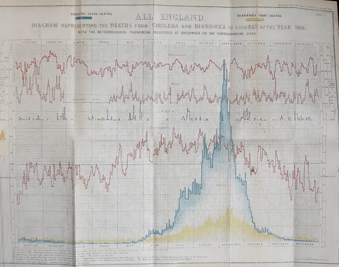
James Riley (2023) notes, "Cholera 1849 has special significance — it is likely to be one of few modern pandemics that was completely unmitigated."
Format
A data frame with 730 observations on the following 6 variables.
montha character vector
cause_of_deatha factor with levels
CholeraDiarrhaeaday_of_montha character vector
deathsa numeric vector
datea Date
day_of_weekan ordered factor with levels
Mon<Tue<Wed<Thu<Fri<Sat<Sun
Details
The data set was transcribed by James Riley to a spreadsheet, https://github.com/jimr1603/1849-cholera. He notes, "the scan at Internet Archive has a fold on day 11. I have derived this column from the row totals."
Source
The original source is: General Register Office, William Farr (1852), Report on the Mortality of Cholera in England, 1848-49. London: Printed by W. Clowes, for HMSO; scanned by the Internet Archive from the collection of King's College London and available at https://archive.org/details/b21308251/page/20/mode/2up.
References
Friendly, M. & Wainer, H. (2021). A History of Data Visualization and Graphic Communication, Harvard University Press. ISBN 9780674975231.
Riley, J. (2023). "Cholera in Victorian England", blog post, https://openor.blog/2023/07/27/cholera-in-victorian-england/.
See Also
Examples
data(CholeraDeaths1849)
str(CholeraDeaths1849)

# Reproduce Farr's (1852) plate 2
library(ggplot2)
CholeraDeaths1849  |>
  ggplot(aes(x = date, y = deaths, colour = cause_of_death)) +
  geom_line(linewidth = 1.2) +
  theme_bw(base_size = 14) +
  theme(legend.position = "top")
Cushny-Peebles Data: Soporific Effects of Scopolamine Derivatives
Description
Cushny and Peebles (1905) studied the effects of hydrobromides related to
scopolamine and atropine in producing sleep. The sleep of mental patients
was measured without hypnotic (Control) and after treatment with one
of three drugs: L. hyoscyamine hydrobromide (L_hyoscyamine), L.
hyoscine hydrobromide (L_hyoscyine), and a mixture (racemic) form,
DL_hyoscine, called atropine. The L (levo) and D (detro) form of a
given molecule are optical isomers (mirror images).
The drugs were given on alternate evenings, and the hours of sleep were compared with the intervening control night. Each of the drugs was tested in this manner a varying number of times in each subject. The average number of hours of sleep for each treatment is the response.
Student (1908) used these data to illustrate the paired-sample t-test in small samples, testing the hypothesis that the mean difference between a given drug and the control condition was zero. This data set became well known when used by Fisher (1925). Both Student and Fisher had problems labeling the drugs correctly (see Senn & Richardson (1994)), and consequently came to wrong conclusions.
But as well, the sample sizes (number of nights) for each mean differed
widely, ranging from 3-9, and this was not taken into account in their
analyses. To allow weighted analyses, the number of observations for each
mean is contained in the data frame CushnyPeeblesN.
Format
CushnyPeebles: A data frame with 11 observations on the
following 4 variables.
Controla numeric vector: mean hours of sleep
L_hyoscyaminea numeric vector: mean hours of sleep
L_hyoscinea numeric vector: mean hours of sleep
D_hyoscinea numeric vector: mean hours of sleep
CushnyPeeblesN: A data frame with 11 observations on the following 4
variables.
Controla numeric vector: number of observations
L_hyoscyaminea numeric vector: number of observations
L_hyoscinea numeric vector: number of observations
DL_hyoscinea numeric vector: number of observations
Details
The last patient (11) has no Control observations, and so is often
excluded in analyses or other versions of this data set.
Source
Cushny, A. R., and Peebles, A. R. (1905), "The Action of Optical Isomers. II: Hyoscines," Journal of Physiology, 32, 501-510.
% Senn, Stephen, Data from Cushny and Peebles, https://www.senns.uk/Data/Cushny.xls
References
Fisher, R. A. (1925), Statistical Methods for Research Workers, Edinburgh and London: Oliver & Boyd.
Student (1908), "The Probable Error of a Mean," Biometrika, 6, 1-25.
Senn, S.J. and Richardson, W. (1994), "The first t-test", Statistics in Medicine, 13, 785-803.
See Also
sleep for an alternative form of this data
set.
Examples
data(CushnyPeebles)
# quick looks at the data
plot(CushnyPeebles)
boxplot(CushnyPeebles, ylab="Hours of Sleep", xlab="Treatment")

##########################
# Repeated measures MANOVA

CPmod <- lm(cbind(Control, L_hyoscyamine, L_hyoscine, DL_hyoscine) ~ 1, data=CushnyPeebles)

# Assign within-S factor and contrasts
Treatment <- factor(colnames(CushnyPeebles), levels=colnames(CushnyPeebles))
contrasts(Treatment) <- matrix(
	c(-3, 1, 1, 1,
	   0,-2, 1, 1,
	   0, 0,-1, 1), ncol=3)
colnames(contrasts(Treatment)) <- c("Control.Drug", "L.DL", "L_hy.DL_hy")

Treats <- data.frame(Treatment)
if (require(car)) {
(CPaov <- Anova(CPmod, idata=Treats, idesign= ~Treatment))
}
summary(CPaov, univariate=FALSE)

if (require(heplots)) {
  heplot(CPmod, idata=Treats, idesign= ~Treatment, iterm="Treatment",
	xlab="Control vs Drugs", ylab="L vs DL drug")
  pairs(CPmod, idata=Treats, idesign= ~Treatment, iterm="Treatment")
}

################################
# reshape to long format, add Ns

CPlong <- stack(CushnyPeebles)[,2:1]
colnames(CPlong) <- c("treatment", "sleep")
CPN <- stack(CushnyPeeblesN)
CPlong <- data.frame(patient=rep(1:11,4), CPlong, n=CPN$values)
str(CPlong)
Edgeworth's counts of dactyls in Virgil's Aeneid
Description
Edgeworth (1885) took the first 75 lines in Book XI of Virgil's Aeneid and classified each of the first four "feet" of the line as a dactyl (one long syllable followed by two short ones) or not.
Grouping the lines in blocks of five gave a 4 x 25 table of counts,
represented here as a data frame with ordered factors, Foot and
Lines. Edgeworth used this table in what was among the first examples
of analysis of variance applied to a two-way classification.
Format
A data frame with 60 observations on the following 3 variables.
Footan ordered factor with levels
1<2<3<4Linesan ordered factor with levels
1:5<6:10<11:15<16:20<21:25<26:30<31:35<36:40<41:45<46:50<51:55<56:60<61:65<66:70<71:75countnumber of dactyls
Source
Stigler, S. (1999) Statistics on the Table Cambridge, MA: Harvard University Press, table 5.1.
References
Edgeworth, F. Y. (1885). On methods of ascertaining variations in the rate of births, deaths and marriages. Journal of the Royal Statistical Society, 48, 628-649.
Examples
data(Dactyl)

# display the basic table
xtabs(count ~ Foot+Lines, data=Dactyl)

# simple two-way anova
anova(dact.lm <- lm(count ~ Foot+Lines, data=Dactyl))

# plot the lm-quartet
op <- par(mfrow=c(2,2))
plot(dact.lm)
par(op)

# show table as a simple mosaicplot
mosaicplot(xtabs(count ~ Foot+Lines, data=Dactyl), shade=TRUE)
Elderton and Pearson's (1910) data on drinking and wages
Description
In 1910, Karl Pearson weighed in on the debate, fostered by the temperance movement, on the evils done by alcohol not only to drinkers, but to their families. The report "A first study of the influence of parental alcoholism on the physique and ability of their offspring" was an ambitious attempt to the new methods of statistics to bear on an important question of social policy, to see if the hypothesis that children were damaged by parental alcoholism would stand up to statistical scrutiny.
Working with his assistant, Ethel M. Elderton, Pearson collected voluminous data in Edinburgh and Manchester on many aspects of health, stature, intelligence, etc. of children classified according to the drinking habits of their parents. His conclusions where almost invariably negative: the tendency of parents to drink appeared unrelated to any thing he had measured.
The firestorm that this report set off is well described by Stigler (1999),
Chapter 1. The data set DrinksWages is just one of Pearson's many
tables, that he published in a letter to The Times, August 10, 1910.
Format
A data frame with 70 observations on the following 6 variables,
giving the number of non-drinkers (sober) and drinkers
(drinks) in various occupational categories (trade).
classwage class: a factor with levels
ABCtradea factor with levels
bakerbarmanbillposter...wellsinkerwireworkersoberthe number of non-drinkers, a numeric vector
drinksthe number of drinkers, a numeric vector
wageweekly wage (in shillings), a numeric vector
ntotal number, a numeric vector
Details
The data give Karl Pearson's tabulation of the father's trades from an Edinburgh sample, classified by whether they drink or are sober, and giving average weekly wage.
The wages are averages of the individuals' nominal wages. Class A is those with wages under 2.5s.; B: those with wages 2.5s. to 30s.; C: wages over 30s.
Source
Pearson, K. (1910). The Times, August 10, 1910.
Stigler, S. M. (1999). Statistics on the Table: The History of Statistical Concepts and Methods. Harvard University Press, Table 1.1
References
M. E. Elderton & K. Pearson (1910). A first study of the influence of parental alcoholism on the physique and ability of their offspring, Eugenics Laboratory Memoirs, 10.
Examples
data(DrinksWages)
plot(DrinksWages)

# plot proportion sober vs. wage | class
with(DrinksWages, plot(wage, sober/n, col=c("blue","red","green")[class]))

# fit logistic regression model of sober on wage
mod.sober <- glm(cbind(sober, n) ~ wage, family=binomial, data=DrinksWages)
summary(mod.sober)
op <- par(mfrow=c(2,2))
plot(mod.sober)
par(op)

# TODO: plot fitted model
Edgeworth's Data on Death Rates in British Counties
Description
In 1885, Francis Edgeworth published a paper, On methods of ascertaining variations in the rate of births, deaths and marriages. It contained among the first examples of two-way tables, analyzed to show variation among row and column factors, in a way that Fisher would later formulate as the Analysis of Variance.
Although the data are rates per 1000, they provide a good example of a two-way ANOVA with n=1 per cell, where an additive model fits reasonably well.
Treated as frequencies, the data is also a good example of a case where the independence model fits reasonably well.
Format
A data frame with 42 observations on the following 3 variables.
Countya factor with levels
BerksHertsBucksOxfordBedfordCambridgeyearan ordered factor with levels
1876<1877<1878<1879<1880<1881<1882Freqa numeric vector, death rate per 1000 population
Details
Edgeworth's data came from the Registrar General's report for the final
year, 1883. The Freq variable represents death rates per 1000
population in the six counties listed.
Source
The data were scanned from Table 5.2 in Stigler, S. M. (1999) Statistics on the Table: The History of Statistical Concepts and Methods, Harvard University Press.
References
Edgeworth, F. Y. (1885). On Methods of Ascertaining Variations in the Rate of Births, Deaths, and Marriages. Journal of the Statistical Society of London, 48(4), 628-649. doi:10.2307/2979201
Examples
data(EdgeworthDeaths)

# fit the additive ANOVA model
library(car)  # for Anova()
EDmod <- lm(Freq ~ County + year, data=EdgeworthDeaths)
Anova(EDmod)

# now, consider as a two-way table of frequencies

library(vcd)
library(MASS)
structable( ~ County + year, data=EdgeworthDeaths)
loglm( Freq ~ County + year, data=EdgeworthDeaths)

mosaic( ~ County + year, data=EdgeworthDeaths,
	shade=TRUE, legend=FALSE, labeling=labeling_values,
	gp=shading_Friendly)
Waite's data on Patterns in Fingerprints
Description
Waite (1915) was interested in analyzing the association of patterns in
fingerprints, and produced a table of counts for 2000 right hands,
classified by the number of fingers describable as a "whorl", a "small loop"
(or neither). Because each hand contributes five fingers, the number of
Whorls + Loops cannot exceed 5, so the contingency table is
necessarily triangular.
Karl Pearson (1904) introduced the test for independence in contingency tables, and by 1913 had developed methods for "restricted contingency tables," such as the triangular table analyzed by Waite. The general formulation of such tests for association in restricted tables is now referred to as models for quasi-independence.
Format
A frequency data frame with 36 observations on the following 3 variables, representing a 6 x 6 table giving the cross-classification of the fingers on 2000 right hands as a whorl, small loop or neither.
WhorlsNumber of whorls, an ordered factor with levels
0<1<2< ... <5LoopsNumber of small loops, an ordered factor with levels
0<1<2<3<4<5countNumber of hands
Details
Cells for which Whorls + Loops > 5 have NA for count
Source
Stigler, S. M. (1999). Statistics on the Table. Cambridge, MA: Harvard University Press, table 19.4.
References
Pearson, K. (1904). Mathematical contributions to the theory of evolution. XIII. On the theory of contingency and its relation to association and normal correlation. Reprinted in Karl Pearson's Early Statistical Papers, Cambridge: Cambridge University Press, 1948, 443-475.
Waite, H. (1915). The analysis of fingerprints, Biometrika, 10, 421-478.
Examples
data(Fingerprints)
xtabs(count ~ Whorls + Loops, data=Fingerprints)
Galton's data on the heights of parents and their children
Description
Galton (1886) presented these data in a table, showing a cross-tabulation of 928 adult children born to 205 fathers and mothers, by their height and their mid-parent's height. He visually smoothed the bivariate frequency distribution and showed that the contours formed concentric and similar ellipses, thus setting the stage for correlation, regression and the bivariate normal distribution.
Format
A data frame with 928 observations on the following 2 variables.
parenta numeric vector: height of the mid-parent (average of father and mother)
childa numeric vector: height of the child
Details
The data are recorded in class intervals of width 1.0 in. He used non-integer values for the center of each class interval because of the strong bias toward integral inches.
All of the heights of female children were multiplied by 1.08 before tabulation to compensate for sex differences. See Hanley (2004) for a reanalysis of Galton's raw data questioning whether this was appropriate.
Source
Galton, F. (1886). Regression Towards Mediocrity in Hereditary Stature Journal of the Anthropological Institute, 15, 246-263
References
Friendly, M. & Denis, D. (2005). The early origins and development of the scatterplot. Journal of the History of the Behavioral Sciences, 41, 103-130.
Galton, F. (1869). Hereditary Genius: An Inquiry into its Laws and Consequences. London: Macmillan.
Hanley, J. A. (2004). "Transmuting" Women into Men: Galton's Family Data on Human Stature. The American Statistician, 58, 237-243. See: https://jhanley.biostat.mcgill.ca/galton/ for source materials.
Stigler, S. M. (1986). The History of Statistics: The Measurement of Uncertainty before 1900. Cambridge, MA: Harvard University Press, Table 8.1
Wachsmuth, A. W., Wilkinson L., Dallal G. E. (2003). Galton's bend: A previously undiscovered nonlinearity in Galton's family stature regression data. The American Statistician, 57, 190-192. doi:10.1198/0003130031874
See the example by John Russell for the 30DayChartChallenge
See Also
GaltonFamilies, PearsonLee,
galton in the psychTools package, galton
Examples
data(Galton)

###########################################################################
# sunflower plot with regression line and data ellipses and lowess smooth
###########################################################################

with(Galton,
	{
	sunflowerplot(parent,child, xlim=c(62,74), ylim=c(62,74))
	reg <- lm(child ~ parent)
	abline(reg)
	lines(lowess(parent, child), col="blue", lwd=2)
	if(require(car)) {
	dataEllipse(parent,child, xlim=c(62,74), ylim=c(62,74), plot.points=FALSE)
		}
  })
Galton's data on the heights of parents and their children, by child
Description
This data set lists the individual observations for 934 children in 205 families on which Galton (1886) based his cross-tabulation.
In addition to the question of the relation between heights of parents and their offspring, for which this data is mainly famous, Galton had another purpose which the data in this form allows to address: Does marriage selection indicate a relationship between the heights of husbands and wives?, a topic he called assortative mating. Keen (2010, p. 297–298) provides a brief discussion of this topic.
Format
A data frame with 934 observations on the following 8 variables.
familyfamily ID, a factor with levels
001-204fatherheight of father
motherheight of mother
midparentHeightmid-parent height, calculated as
(father + 1.08*mother)/2childrennumber of children in this family
childNumnumber of this child within family. Children are listed in decreasing order of height for boys followed by girls
genderchild gender, a factor with levels
femalemalechildHeightheight of child
Details
Galton's notebook lists 963 children in 205 families ranging from 1-15 adult children children. Of these, 29 had non-numeric heights recorded and are not included here.
Families are largely listed in descending order of fathers and mothers height.
Source
Galton's notebook, https://jhanley.biostat.mcgill.ca/galton/galton_heights_197_families.txt, transcribed by Beverley Shipley in 2001.
References
Galton, F. (1886). Regression Towards Mediocrity in Hereditary Stature Journal of the Anthropological Institute, 15, 246-263
Hanley, J. A. (2004). "Transmuting" Women into Men: Galton's Family Data on Human Stature. The American Statistician, 58, 237-243. See: https://jhanley.biostat.mcgill.ca/galton/ for source materials.
Keen, K. J. (2010). Graphics for Statistics and Data Analysis with R, Boca Raton: CRC Press, https://www.unbc.ca/keen/textbook.
See Also
Examples
data(GaltonFamilies)
str(GaltonFamilies)

## reproduce Fig 2 in Hanley (2004)
library(car)
scatterplot(childHeight ~ midparentHeight | gender, data=GaltonFamilies,
    ellipse=TRUE, levels=0.68, legend.coords=list(x=64, y=78))

# multiply daughters' heights by 1.08
GF1 <- within(GaltonFamilies,
              {childHeight <- ifelse (gender=="female", 1.08*childHeight, childHeight)} )
scatterplot(childHeight ~ midparentHeight | gender, data=GF1,
    ellipse=TRUE, levels=0.68, legend.coords=list(x=64, y=78))

# add 5.2 to daughters' heights
GF2 <- within(GaltonFamilies,
              {childHeight <- ifelse (gender=="female", childHeight+5.2, childHeight)} )
scatterplot(childHeight ~ midparentHeight | gender, data=GF2,
    ellipse=TRUE, levels=0.68, legend.coords=list(x=64, y=78))

#########################################
# relationship between heights of parents
#########################################

Parents <- subset(GaltonFamilies, !duplicated(GaltonFamilies$family))

with(Parents, {
  sunflowerplot(mother, father, rotate=TRUE, pch=16,
     xlab="Mother height", ylab="Father height")
	dataEllipse(mother, father, add=TRUE, plot.points=FALSE,
     center.pch=NULL, levels=0.68)
	abline(lm(father ~ mother), col="red", lwd=2)
	}
	)
Data from A.-M. Guerry, "Essay on the Moral Statistics of France"
Description
Andre-Michel Guerry (1833) was the first to systematically collect and analyze social data on such things as crime, literacy and suicide with the view to determining social laws and the relations among these variables.
The Guerry data frame comprises a collection of 'moral variables' on the 86
departments of France around 1830. A few additional variables have been
added from other sources.
Format
A data frame with 86 observations (the departments of France) on the following 23 variables.
deptDepartment ID: Standard numbers for the departments, except for Corsica (200)
RegionRegion of France ('N'='North', 'S'='South', 'E'='East', 'W'='West', 'C'='Central'). Corsica is coded as NA
DepartmentDepartment name: Departments are named according to usage in 1830, but without accents. A factor with levels
Ain,Aisne,Allier, ...,Vosges,YonneCrime_persPopulation per Crime against persons. Source: A2 (Compte general, 1825-1830)
Crime_propPopulation per Crime against property. Source: A2 (Compte general, 1825-1830)
LiteracyPercent Read & Write: Percent of military conscripts who can read and write. Source: A2
DonationsDonations to the poor. Source: A2 (Bulletin des lois)
InfantsPopulation per illegitimate birth. Source: A2 (Bureau des Longitudes, 1817-1821)
SuicidesPopulation per suicide. Source: A2 (Compte general, 1827-1830)
MainCitySize of principal city ('1:Sm', '2:Med', '3:Lg'), used as a surrogate for population density. Large refers to the top 10, small to the bottom 10; all the rest are classed Medium. Source: A1. An ordered factor with levels
1:Sm<2:Med<3:LgWealthPer capita tax on personal property. A ranked index based on taxes on personal and movable property per inhabitant. Source: A1
CommerceCommerce and Industry, measured by the rank of the number of patents / population. Source: A1
ClergyDistribution of clergy, measured by the rank of the number of Catholic priests in active service / population. Source: A1 (Almanach officiel du clergy, 1829)
Crime_parentsCrimes against parents, measured by the rank of the ratio of crimes against parents to all crimes– Average for the years 1825-1830. Source: A1 (Compte general)
InfanticideInfanticides per capita. A ranked ratio of number of infanticides to population– Average for the years 1825-1830. Source: A1 (Compte general)
Donation_clergyDonations to the clergy. A ranked ratio of the number of bequests and donations inter vivios to population– Average for the years 1815-1824. Source: A1 (Bull. des lois, ordunn. d'autorisation)
LotteryPer capita wager on Royal Lottery. Ranked ratio of the proceeds bet on the royal lottery to population— Average for the years 1822-1826. Source: A1 (Compte rendus par le ministere des finances)
DesertionMilitary desertion, ratio of the number of young soldiers accused of desertion to the force of the military contingent, minus the deficit produced by the insufficiency of available billets– Average of the years 1825-1827. Source: A1 (Compte du ministere du guerre, 1829 etat V)
InstructionInstruction. Ranks recorded from Guerry's map of Instruction. Note: this is inversely related to
Literacy(as defined here)ProstitutesProstitutes in Paris. Number of prostitutes registered in Paris from 1816 to 1834, classified by the department of their birth Source: Parent-Duchatelet (1836), De la prostitution en Paris
DistanceDistance to Paris (km). Distance of each department centroid to the centroid of the Seine (Paris) Source: calculated from department centroids
AreaArea (1000 km^2). Source: Angeville (1836)
Pop18311831 population. Population in 1831, taken from Angeville (1836), Essai sur la Statistique de la Population fran?ais, in 1000s
Details
Note that most of the variables (e.g., Crime_pers) are scaled so that
'more is better' morally.
This is done by expressing "bad" numbers as population per crime or by using ranks.
Thus, in his choropleth maps, he was able to assign darker shading consistently to the departments that were worse.
Values for the quantitative variables displayed on Guerry's maps were taken from Table A2 in the English translation of Guerry (1833) by Whitt and Reinking. Values for the ranked variables were taken from Table A1, with some corrections applied. The maximum is indicated by rank 1, and the minimum by rank 86.
Source
Angeville, A. (1836). Essai sur la Statistique de la Population fran?aise Paris: F. Doufour.
Guerry, A.-M. (1833). Essai sur la statistique morale de la France Paris: Crochard. English translation: Hugh P. Whitt and Victor W. Reinking, Lewiston, N.Y. : Edwin Mellen Press, 2002.
Parent-Duchatelet, A. (1836). De la prostitution dans la ville de Paris, 3rd ed, 1857, p. 32, 36
See the example by John Russell for the 30DayChartChallenge
References
Dray, S. and Jombart, T. (2011). A Revisit Of Guerry's Data: Introducing Spatial Constraints In Multivariate Analysis. The Annals of Applied Statistics, Vol. 5, No. 4, 2278-2299. https://arxiv.org/pdf/1202.6485, DOI: 10.1214/10-AOAS356.
Brunsdon, C. and Dykes, J. (2007). Geographically weighted visualization: interactive graphics for scale-varying exploratory analysis. Geographical Information Science Research Conference (GISRUK 07), NUI Maynooth, Ireland, April, 2007.
Friendly, M. (2007). A.-M. Guerry's Moral Statistics of France: Challenges for Multivariable Spatial Analysis. Statistical Science, 22, 368-399.
Friendly, M. (2007). Data from A.-M. Guerry, Essay on the Moral Statistics of France (1833), http://datavis.ca/gallery/guerry/guerrydat.html.
See Also
The Guerry package for maps of France:
gfrance, related data, creating maps of his data and multivariate spatial analysis.
Examples
data(Guerry)
## maybe str(Guerry) ; plot(Guerry) ...
Halley's Life Table
Description
In 1693 the famous English astronomer Edmond Halley studied the birth and death records of the city of Breslau, which had been transmitted to the Royal Society by Caspar Neumann. He produced a life table showing the number of people surviving to any age from a cohort born the same year. He also used his table to compute the price of life annuities.
Format
A data frame with 84 observations on the following 4 variables.
agea numeric vector
deathsnumber of deaths,
D_k, among people of age k, a numeric vectornumbersize of the population,
P_ksurviving until this age, a numeric vectorratiothe ratio
P_{k+1}/P_k, the conditional probability of surviving until age k + 1 given that one had already reached age k, a numeric vector
Details
Halley's table contained only age and number. For people aged
over 84 years, Halley just noted that their total number was 107. This value
is not included in the data set.
The data from Breslau had a mean of 1,238 births per year: this is the value
that Halley took for the size, P_0 of the population cohort at age 0.
From the data, he could compute the annual mean D_k of the number of
deaths among people aged k for all k >= 0. From this, he
calculated the number P_{k+1} surviving one more year,
P_{k+1} =
P_k - D_k
This method had the great advantage of not requiring a general census but only knowledge of the number of births and deaths and of the age at which people died during a few years.
Source
N. Bacaer (2011), "Halley's life table (1693)", Ch 2, pp 5-10. In A Short History of Mathematical Population Dynamics, Springer-Verlag London, DOI 10.1007/978-0-85729-115-8_2. Data taken from Table 1.
References
Halley, E. (1693). An estimate of the degrees of the mortality of mankind, drawn from curious tables of the births and funerals at the city of Breslau; with an attempt to ascertain the price of annuities upon lives. Philosophical Transactions of the Royal Society, London, 17, 596-610.
The text of Halley's paper was found at http://www.pierre-marteau.com/editions/1693-mortality.html
See Also
Examples
data(HalleyLifeTable)
# what was the estimated population of Breslau?
sum(HalleyLifeTable$number)

# plot survival vs. age
plot(number ~ age, data=HalleyLifeTable, type="h", ylab="Number surviving")

# population pyramid is transpose of this
plot(age ~ number, data=HalleyLifeTable, type="l", xlab="Number surviving")
with(HalleyLifeTable, segments(0, age, number, age, lwd=2))

# conditional probability of survival, one more year
plot(ratio ~ age, data=HalleyLifeTable, ylab="Probability survive one more year")
W. Stanley Jevons' data on Numerical Discrimination
Description
In a remarkable brief note in Nature, 1871, W. Stanley Jevons described the results of an experiment he had conducted on himself to determine the limits of the number of objects an observer could comprehend immediately without counting them. This was an important philosophical question: How many objects can the mind embrace at once?
He carried out 1027 trials in which he tossed an "uncertain number" of uniform black beans into a box and immediately attempted to estimate the number "without the least hesitation". His questions, procedure and analysis anticipated by 75 years one of the most influential papers in modern cognitive psychology by George Miller (1956), "The magical number 7 plus or minus 2: Some limits on ..." For Jevons, the magical number was 4.5, representing an empirical law of complete accuracy.
Format
A frequency data frame with 50 observations on the following 4 variables.
actualActual number: a numeric vector
estimatedEstimated number: a numeric vector
frequencyFrequency of this combination of (actual, estimated): a numeric vector
erroractual-estimated: a numeric vector
Details
The original data were presented in a two-way, 13 x 13 frequency table,
estimated (3:15) x actual (3:15).
Source
Jevons, W. S. (1871). The Power of Numerical Discrimination, Nature, 1871, III (281-282)
References
Miller, G. A. (1956). The Magical Number Seven, Plus or Minus Two: Some Limits on Our Capacity for Processing Information, Psychological Review, 63, 81-97, http://www.musanim.com/miller1956/
Examples
data(Jevons)
# show as tables
xtabs(frequency ~ estimated+actual, data=Jevons)
xtabs(frequency ~ error+actual, data=Jevons)

# show as sunflowerplot with regression line
with(Jevons, sunflowerplot(actual, estimated, frequency,
  main="Jevons data on numerical estimation"))
Jmod <-lm(estimated ~ actual, data=Jevons, weights=frequency)
abline(Jmod)

# show as balloonplots
if (require(gplots)) {

with(Jevons, balloonplot(actual, estimated, frequency, xlab="actual", ylab="estimated",
  main="Jevons data on numerical estimation\nBubble area proportional to frequency",
  text.size=0.8))

with(Jevons, balloonplot(actual, error, frequency, xlab="actual", ylab="error",
  main="Jevons data on numerical estimation: Errors\nBubble area proportional to frequency",
  text.size=0.8))
}

# plot average error
if(require(reshape)) {
unJevons <- untable(Jevons, Jevons$frequency)
str(unJevons)

require(plyr)
mean_error <- function(df) mean(df$error, na.rm=TRUE)
Jmean <- ddply(unJevons, .(actual), mean_error)
with(Jmean, plot(actual, V1, ylab='Mean error', xlab='Actual number', type='b', main='Jevons data'))
abline(h=0)
}
van Langren's Data on Longitude Distance between Toledo and Rome
Description
Michael Florent van Langren (1598-1675) was a Dutch mathematician and astronomer, who served as a royal mathematician to King Phillip IV of Spain, and who worked on one of the most significant problems of his time— the accurate determination of longitude, particularly for navigation at sea.
Format
Langren1644: A data frame with 12 observations on the
following 9 variables, giving determinations of the distance in longitude
between Toledo and Rome, from the 1644 graph.
NameThe name of the person giving a determination, a factor with levels
A. Argelius...T. BraheLongitudeEstimated value of the longitude distance between Toledo and Rome
YearYear associated with this determination
LongnameA longer version of the
Name, where appropriate; a factor with levelsAndrea ArgoliChristoph ClaviusTycho BraheCityThe principal city where this person worked; a factor with levels
AlexandriaAmsterdamBambergBolognaFrankfurtHvenLeuvenMiddelburgNurembergPaduaParisRomeCountryThe country where this person worked; a factor with levels
BelgiumDenmarkEgyptFlandersFranceGermanyItalyItalyLatitudeLatitude of this
City; a numeric vectorSourceLikely source for this determination of Longitude; a factor with levels
AstronMapGapA numeric vector indicating whether the
Longitudevalue is below or above th median
Langren.all: A data frame with 61 observations on the following 4
variables, giving determinations of Longitude between Toledo and Rome from
all known versions of van Langren's graph.
AuthorAuthor of the graph, a factor with levels
LangrenLelewelYearYear of publication
NameThe name of the person giving a determination, a factor with levels
Algunos1Algunos2Apianus...SchonerusLongitudeEstimated value of the longitude distance between Toledo and Rome
Details
In order to convince the Spanish court of the seriousness of the problem (often resulting in great losses through ship wrecks), he prepared a 1-dimensional line graph, showing all the available estimates of the distance in longitude between Toledo and Rome, which showed large errors, for even this modest distance. This 1D line graph, from Langren (1644), is believed to be the first known graph of statistical data (Friendly etal., 2010). It provides a compelling example of the notions of statistical variability and bias.
The data frame Langren1644 gives the estimates and other information
derived from the previously known 1644 graph. It turns out that van Langren
produced other versions of this graph, as early as 1628. The data frame
Langren.all gives the estimates derived from all known versions of
this graph.
In all the graphs, Toledo is implicitly at the origin and Rome is located
relatively at the value of Longitude. To judge correspondence with an
actual map, the positions in (lat, long) are
toledo <- c(39.86, -4.03); rome <- c(41.89, 12.5)
Source
The longitude values were digitized from images of the various graphs, which may be found on the Supplementary materials page for Friendly etal. (2009).
References
Friendly, M., Valero-Mora, P. and Ulargui, J. I. (2010). The First (Known) Statistical Graph: Michael Florent van Langren and the "Secret" of Longitude. The American Statistician, 64 (2), 185-191. Supplementary materials: http://datavis.ca/gallery/langren/.
Langren, M. F. van. (1644). La Verdadera Longitud por Mar y Tierra. Antwerp: (n.p.), 1644. English translation available at http://datavis.ca/gallery/langren/verdadera.pdf.
Lelewel, J. (1851). Geographie du Moyen Age. Paris: Pilliet, 1851.
Examples
data(Langren1644)

####################################################
# reproductions of Langren's graph overlaid on a map
####################################################

if (require(jpeg, quietly=TRUE)) {

  gimage <- readJPEG(system.file("images", "google-toledo-rome3.jpg", package="HistData"))
  # NB: dimensions from readJPEG are y, x, colors

  gdim <- dim(gimage)[1:2]
  ylim <- c(1,gdim[1])
  xlim <- c(1,gdim[2])
  op <- par(bty="n", xaxt="n", yaxt="n", mar=c(2, 1, 1, 1) + 0.1)
  # NB: necessary to scale the plot to the pixel coordinates, and use asp=1
  plot(xlim, ylim, xlim=xlim, ylim=ylim, type="n", ann=FALSE, asp=1 )
  rasterImage(gimage, 1, 1, gdim[2], gdim[1])

  # pixel coordinates of Toledo and Rome in the image, measured from the bottom left corner
  toledo.map <- c(131, 59)
  rome.map <- c(506, 119)

  # confirm locations of Toledo and Rome
  points(rbind(toledo.map, rome.map), cex=2)
  text(131, 95, "Toledo", cex=1.5)
  text(506, 104, "Roma", cex=1.5)

  # set a scale for translation of lat,long to pixel x,y
  scale <- data.frame(x=c(131, 856), y=c(52,52))
  rownames(scale)=c(0,30)

  # translate from degrees longitude to pixels
  xlate <- function(x) {
    131+x*726/30
  }

  # draw an axis
  lines(scale)
  ticks <- xlate(seq(0,30,5))
  segments(ticks, 52, ticks, 45)
  text(ticks, 40, seq(0,30,5))
  text(xlate(8), 17, "Grados de la Longitud", cex=1.7)

  # label the observations with the names
  points(x=xlate(Langren1644$Longitude), y=rep(57, nrow(Langren1644)),
         pch=25, col="blue", bg="blue")
  text(x=xlate(Langren1644$Longitude), y=rep(57, nrow(Langren1644)),
       labels=Langren1644$Name, srt=90, adj=c(-.1, .5), cex=0.8)
  par(op)
}

### Original implementation using ReadImages, now deprecated & shortly to be removed
## Not run:
if (require(ReadImages)) {
  gimage <- read.jpeg(system.file("images", "google-toledo-rome3.jpg", package="HistData"))
  plot(gimage)

  # pixel coordinates of Toledo and Rome in the image, measured from the bottom left corner
  toledo.map <- c(130, 59)
  rome.map <- c(505, 119)

  # confirm locations of Toledo and Rome
  points(rbind(toledo.map, rome.map), cex=2)

  # set a scale for translation of lat,long to pixel x,y
  scale <- data.frame(x=c(130, 856), y=c(52,52))
  rownames(scale)=c(0,30)
  lines(scale)

  xlate <- function(x) {
    130+x*726/30
  }
  points(x=xlate(Langren1644$Longitude), y=rep(57, nrow(Langren1644)),
         pch=25, col="blue")
  text(x=xlate(Langren1644$Longitude), y=rep(57, nrow(Langren1644)),
         labels=Langren1644$Name, srt=90, adj=c(0, 0.5), cex=0.8)
}

## End(Not run)

### First attempt using ggplot2; temporarily abandonned.
## Not run:
require(maps)
require(ggplot2)
require(reshape)
require(plyr)
require(scales)

# set latitude to that of Toledo
Langren1644$Latitude <- 39.68

#          x/long   y/lat
bbox <- c( 38.186, -9.184,
           43.692, 28.674 )
bbox <- matrix(bbox, 2, 2, byrow=TRUE)

borders <- as.data.frame(map("world", plot = FALSE,
  xlim = expand_range(bbox[,2], 0.2),
  ylim = expand_range(bbox[,1], 0.2))[c("x", "y")])

data(world.cities)
# get actual locations of Toledo & Rome
cities <- subset(world.cities,
  name %in% c("Rome", "Toledo") & country.etc %in% c("Spain", "Italy"))
colnames(cities)[4:5]<-c("Latitude", "Longitude")

mplot <- ggplot(Langren1644, aes(Longitude, Latitude) ) +
  geom_path(aes(x, y), borders, colour = "grey60") +
  geom_point(y = 40) +
  geom_text(aes(label = Name), y = 40.1, angle = 90, hjust = 0, size = 3)
mplot <- mplot +
	geom_segment(aes(x=-4.03, y=40, xend=30, yend=40))

mplot <- mplot +
  geom_point(data = cities, colour = "red", size = 2) +
  geom_text(data=cities, aes(label=name), color="red", size=3, vjust=-0.5) +
  coord_cartesian(xlim=bbox[,2], ylim=bbox[,1])

# make the plot have approximately aspect ratio = 1
windows(width=10, height=2)
mplot

## End(Not run)


###########################################
# show variation in estimates across graphs
###########################################

library(lattice)
graph <- paste(Langren.all$Author, Langren.all$Year)
dotplot(Name ~ Longitude, data=Langren.all)

dotplot( as.factor(Year) ~ Longitude, data=Langren.all, groups=Name, type="o")

dotplot(Name ~ Longitude|graph, data=Langren.all, groups=graph)

# why the gap?
gap.mod <- glm(Gap ~ Year + Source + Latitude, family=binomial, data=Langren1644)
anova(gap.mod, test="Chisq")
Macdonell's Data on Height and Finger Length of Criminals, used by Gosset (1908)
Description
In the second issue of Biometrika, W. R. Macdonell (1902) published
an extensive paper, On Criminal Anthropometry and the Identification
of Criminals in which he included numerous tables of physical
characteristics 3000 non-habitual male criminals serving their sentences in
England and Wales. His Table III (p. 216) recorded a bivariate frequency
distribution of height by finger length. His main purpose was
to show that Scotland Yard could have indexed their material more
efficiently, and find a given profile more quickly.
W. S. Gosset (aka "Student") used these data in two classic papers in 1908, in which he derived various characteristics of the sampling distributions of the mean, standard deviation and Pearson's r. He said, "Before I had succeeded in solving my problem analytically, I had endeavoured to do so empirically." Among his experiments, he randomly shuffled the 3000 observations from Macdonell's table, and then grouped them into samples of size 4, 8, ..., calculating the sample means, standard deviations and correlations for each sample.
Format
Macdonell: A frequency data frame with 924 observations on
the following 3 variables giving the bivariate frequency distribution of
height and finger.
heightlower class boundaries of height, in decimal ft.
fingerlength of the left middle finger, in mm.
frequencyfrequency of this combination of
heightandfinger
MacdonellDF: A data
frame with 3000 observations on the following 2 variables.
heighta numeric vector
fingera numeric vector
Details
Class intervals for height in Macdonell's table were given in 1 in.
ranges, from (4' 7" 9/16 - 4' 8" 9/16), to (6' 4" 9/16 - 6' 5" 9/16). The
values of height are taken as the lower class boundaries.
For convenience, the data frame MacdonellDF presents the same data,
in expanded form, with each combination of height and finger
replicated frequency times.
Source
Macdonell, W. R. (1902). On Criminal Anthropometry and the Identification of Criminals. Biometrika, 1(2), 177-227. doi:10.1093/biomet/1.2.177
The data used here were obtained from:
Hanley, J. (2008). Macdonell data used by Student. https://jhanley.biostat.mcgill.ca/Student/
References
Hanley, J. and Julien, M. and Moodie, E. (2008). Student's z, t, and s: What if Gosset had R? The American Statistician, 62(1), 64-69.
Gosset, W. S. (Student) (1908). Probable error of a mean. Biometrika, 6(1), 1-25. https://www.york.ac.uk/depts/maths/histstat/student.pdf
Gosset, W. S. (Student) (1908). Probable error of a correlation coefficient. Biometrika, 6, 302-310.
Examples
data(Macdonell)

# display the frequency table
xtabs(frequency ~ finger+round(height,3), data=Macdonell)

## Some examples by james.hanley@mcgill.ca    October 16, 2011
## https://jhanley.biostat.mcgill.ca/
## See:  https://jhanley.biostat.mcgill.ca/Student/

###############################################
##  naive contour plots of height and finger ##
###############################################

# make a 22 x 42 table
attach(Macdonell)
ht <- unique(height)
fi <- unique(finger)
fr <- t(matrix(frequency, nrow=42))
detach(Macdonell)


dev.new(width=10, height=5)  # make plot double wide
op <- par(mfrow=c(1,2),mar=c(0.5,0.5,0.5,0.5),oma=c(2,2,0,0))

dx <- 0.5/12
dy <- 0.5/12

plot(ht,ht,xlim=c(min(ht)-dx,max(ht)+dx),
           ylim=c(min(fi)-dy,max(fi)+dy), xlab="", ylab="", type="n" )

# unpack  3000 heights while looping though the frequencies
heights <- c()
for(i in 1:22) {
	for (j in 1:42) {
	 f  <-  fr[i,j]
	 if(f>0) heights <- c(heights,rep(ht[i],f))
	 if(f>0) text(ht[i], fi[j], toString(f), cex=0.4, col="grey40" )
	}
}
text(4.65,13.5, "Finger length (cm)",adj=c(0,1), col="black") ;
text(5.75,9.5, "Height (feet)", adj=c(0,1), col="black") ;
text(6.1,11, "Observed bin\nfrequencies", adj=c(0.5,1), col="grey40",cex=0.85) ;
# crude countour plot
contour(ht, fi, fr, add=TRUE, drawlabels=FALSE, col="grey60")


# smoother contour plot (Galton smoothed 2-D frequencies this way)
# [Galton had experience with plotting isobars for meteorological data]
# it was the smoothed plot that made him remember his 'conic sections'
# and ask a mathematician to work out for him the iso-density
# contours of a bivariate Gaussian distribution...

dx <- 0.5/12; dy <- 0.05  ; # shifts caused by averaging

plot(ht,ht,xlim=c(min(ht),max(ht)),ylim=c(min(fi),max(fi)), xlab="", ylab="", type="n"  )

sm.fr <- matrix(rep(0,21*41),nrow <- 21)
for(i in 1:21) {
	for (j in 1:41) {
	   smooth.freq  <-  (1/4) * sum( fr[i:(i+1), j:(j+1)] )
	   sm.fr[i,j]  <-  smooth.freq
	   if(smooth.freq > 0 )
	   text(ht[i]+dx, fi[j]+dy, sub("^0.", ".",toString(smooth.freq)), cex=0.4, col="grey40" )
	   }
	}

contour(ht[1:21]+dx, fi[1:41]+dy, sm.fr, add=TRUE, drawlabels=FALSE, col="grey60")
text(6.05,11, "Smoothed bin\nfrequencies", adj=c(0.5,1), col="grey40", cex=0.85) ;
par(op)
dev.new()    # new default device

#######################################
## bivariate kernel density estimate
#######################################

if(require(KernSmooth)) {
MDest <- bkde2D(MacdonellDF, bandwidth=c(1/8, 1/8))
contour(x=MDest$x1, y=MDest$x2, z=MDest$fhat,
	xlab="Height (feet)", ylab="Finger length (cm)", col="red", lwd=2)
with(MacdonellDF, points(jitter(height), jitter(finger), cex=0.5))
}

#############################################################
## sunflower plot of height and finger with data ellipses  ##
#############################################################

with(MacdonellDF,
	{
	sunflowerplot(height, finger, size=1/12, seg.col="green3",
		xlab="Height (feet)", ylab="Finger length (cm)")
	reg <- lm(finger ~ height)
	abline(reg, lwd=2)
	if(require(car)) {
	dataEllipse(height, finger, plot.points=FALSE, levels=c(.40, .68, .95))
		}
  })


############################################################
## Sampling distributions of sample sd (s) and z=(ybar-mu)/s
############################################################

# note that Gosset used a divisor of n (not n-1) to get the sd.
# He also used Sheppard's correction for the 'binning' or grouping.
# with concatenated height measurements...

mu <- mean(heights) ; sigma <- sqrt( 3000 * var(heights)/2999 )
c(mu,sigma)

# 750 samples of size n=4 (as Gosset did)

# see Student's z, t, and s: What if Gosset had R?
# [Hanley J, Julien M, and Moodie E. The American Statistician, February 2008]

# see also the photographs from Student's notebook ('Original small sample data and notes")
# under the link "Gosset' 750 samples of size n=4"
# on website https://jhanley.biostat.mcgill.ca/Student/
# and while there, look at the cover of the Notebook containing his yeast-cell counts
# https://jhanley.biostat.mcgill.ca/Student/750samplesOf4
# (Biometrika 1907) and decide for yourself why Gosset, when forced to write under a
# pen-name, might have taken the name he did!

# PS: Can you figure out what the 750 pairs of numbers signify?
# hint: look again at the numbers of rows and columns in Macdonell's (frequency) Table III.


n <- 4
Nsamples <- 750

y.bar.values <- s.over.sigma.values <- z.values <- c()
for (samp in 1:Nsamples) {
	y <- sample(heights,n)
	y.bar <- mean(y)
	s  <-  sqrt( (n/(n-1))*var(y) )
	z <- (y.bar-mu)/s
	y.bar.values <- c(y.bar.values,y.bar)
	s.over.sigma.values <- c(s.over.sigma.values,s/sigma)
	z.values <- c(z.values,z)
	}


op <- par(mfrow=c(2,2),mar=c(2.5,2.5,2.5,2.5),oma=c(2,2,0,0))
# sampling distributions
hist(heights,breaks=seq(4.5,6.5,1/12), main="Histogram of heights (N=3000)")
hist(y.bar.values, main=paste("Histogram of y.bar (n=",n,")",sep=""))

hist(s.over.sigma.values,breaks=seq(0,4,0.1),
	main=paste("Histogram of s/sigma (n=",n,")",sep=""));
z=seq(-5,5,0.25)+0.125
hist(z.values,breaks=z-0.125, main="Histogram of z=(ybar-mu)/s")
# theoretical
lines(z, 750*0.25*sqrt(n-1)*dt(sqrt(n-1)*z,3), col="red", lwd=1)
par(op)

#####################################################
## Chisquare probability plot for bivariate normality
#####################################################

mu <- colMeans(MacdonellDF)
sigma <- var(MacdonellDF)
Dsq <- mahalanobis(MacdonellDF, mu, sigma)

Q <- qchisq(1:3000/3000, 2)
plot(Q, sort(Dsq), xlab="Chisquare (2) quantile", ylab="Squared distance")
abline(a=0, b=1, col="red", lwd=2)
Mayer's Data on the Libration of the Moon.
Description
Mayer had twenty-seven days' observations of Manilius and only three unknowns. The form of Mayer's problem is almost the same as that of Legendre, who developed later the least squares method.
Format
A data frame with 27 observations on the following 4 variables.
Equationan integer vector, id of the Equation
Ya numeric vector, representing the term
(h-90)(see details)X1a numeric vector, representing
\betaX2a numeric vector, representing
\alphaX3a numeric vector, representing the term
\alpha sin\thetaGroupa character vector, representing the Mayer grouping
Details
"How did Mayer address his overdetermined system of equations? His approach
was a simple and straightforward one, so simple and straightforward that a
twentieth-century reader might arrive at the very mistaken opinion that the
procedure was not remarkable at all. Mayer divided his equations into three
groups of nine equations each, added each of the three groups separately,
and solved the resulting three linear equations for \alpha,
\beta and \alpha sin\theta (and then solved for \theta).
His choice of which equations belonged in which groups was based upon the
coefficients of \alpha and \alpha sin \theta. The first group
consisted of the nine equations with the largest positive values for the
coefficient of a, namely, equations 1,2, 3, 6, 9, 10, 11,12, and 27. The
second group were those with the nine largest negative values for this
coefficient: equations 8, 18, 19, 21, 22, 23, 24, 25, and 26. The remaining
nine equations formed the third group, which he described as having the
largest values for the coefficient of \alpha \sin \theta."
Stigler (1986, p.21)
Stigler (1986) says:
"The development of the method of least squares was closely associated with three of the major scientific problems of the eighteenth century: (1) to determine and represent mathematically the motions of the moon; (2) to account for an apparently secular (that is, nonperiodic) inequality that had been observed in the motions of the planets Jupiter and Saturn; and (3) to determine the shape or figure of the earth. These problems all involved astronomical observations and the theory of gravitational attraction, and they all presented intellectual challenges that engaged the attention of many of the ablest mathematical scientists of the period.
Over the period from April 1748 to March 1749, Mayer made numerous observations of the positions of several prominent lunar features; and in his 1750 memoir he showed how these data could be used to determine various characteristics of the moon's orbit. His method of handling the data was novel, and it is well worth considering this method in detail, both for the light it sheds on his pioneering, if limited, understanding of the problem and because his approach was widely circulated in the major contemporary treatise on astronomy, having signal influence upon later work."
His analysis led to this equation:
\beta - (90-h) = \alpha \sin(g-k) - \alpha \sin\theta \cos(g-k)
According to Stigler (1986, p. 21), this "equation would hold if no errors were present. The modern tendency would be to write, say":
(h - 90) = - \beta + \alpha \sin (g - k) - \alpha \sin\theta \cos(g - k)
+ E
treating (h - 90) as the dependent variable and -\beta,
\alpha, and -\alpha \sin \theta as the parameters in a linear
regression model.
Author(s)
Luiz Fernando Palin Droubi
Source
Stigler, Stephen M. (1986). The History of Statistics: The Measurement of Uncertainty before 1900. Cambridge, MA: Harvard University Press, 1986, Table 1.1, p. 22.
Examples
library(sp)
library(effects)
data(Mayer)

# some scatterplots
plot(Y ~ X2, pch=(15:17)[as.factor(Group)],
             col=c("red", "blue", "darkgreen")[as.factor(Group)], data=Mayer)
abline(lm(Y ~ X2, data=Mayer), lwd=2)

plot(Y ~ X3, pch=(15:17)[as.factor(Group)],
             col=c("red", "blue", "darkgreen")[as.factor(Group)], data=Mayer)
abline(lm(Y ~ X3, data=Mayer), lwd=2)


fit <- lm(Y ~ X2 + X3, data=Mayer)
plot(predictorEffects(fit, residuals=TRUE))


Avg_Method <- aggregate(Mayer[, 2:5], by = list(Group = Mayer$Group), FUN=sum)
fit_Mayer <- lm(Y ~ X1 + X2 + X3 - 1, Avg_Method)

## See Stigler (1986, p. 23)
## W means that the angle found is negative.

coeffs <- coef(fit_Mayer)
(alpha <- dd2dms(coeffs[2]))
(beta <- dd2dms(coeffs[1]))
(theta <- dd2dms(asin(coeffs[3]/coeffs[2])*180/pi))
Michelson's Determinations of the Velocity of Light
Description
The data frame Michelson gives Albert Michelson's measurements of the
velocity of light in air, made from June 5 to July 2, 1879, reported in
Michelson (1882). The given values + 299,000 are Michelson's measurements
in km/sec. The number of cases is 100 and the "true" value on this scale is
734.5.
Stigler (1977) used these data to illustrate properties of robust estimators
with real, historical data. For this purpose, he divided the 100
measurements into 5 sets of 20 each. These are contained in
MichelsonSets.
Format
Michelson: A data frame with 100 observations on the
following variable, given in time order of data collection
velocitya numeric vector
MichelsonSets: A 20 x 5 matrix, with format
 int [1:20, 1:5] 850 850 1000 810 960 800 830 830 880 720 ...
 - attr(*, "dimnames")=List of 2
  ..$ : NULL
  ..$ : chr [1:5] "ds12" "ds13" "ds14" "ds15" ...#'
Details
The "true" value is taken to be 734.5, arrived at by taking the "true" speed of light in a vacuum to be 299,792.5 km/sec, and adjusting for the velocity in air.
The data values are recorded in order, and so may also be taken as a time series.
Source
Originally from Kyle Siegrist, "Virtual Laboratories in Probability and Statistics", link no longer works.
Stephen M. Stigler (1977), "Do robust estimators work with real data?", Annals of Statistics, 5, 1055-1098
References
Michelson, A. A. (1882). "Experimental determination of the velocity of light made at the United States Naval Academy, Anapolis". Astronomical Papers, 1, 109-145, U. S. Nautical Almanac Office.
See Also
morley for these data in another format
Examples
data(Michelson)

# density plot (default bandwidth & 0.6 * bw)
plot(density(Michelson$velocity), xlab="Speed of light - 299000 (km/s)",
	main="Density plots of Michelson data")
lines(density(Michelson$velocity, adjust=0.6), lty=2)
rug(jitter(Michelson$velocity))
abline(v=mean(Michelson$velocity), col="blue")
abline(v=734.5, col="red", lwd=2)
text(mean(Michelson$velocity), .004, "mean", srt=90, pos=2)
text(734.5, .004, "true", srt=90, pos=2)

# index / time series plot
plot(Michelson$velocity, type="b")
abline(h=734.5, col="red", lwd=2)
lines(lowess(Michelson$velocity), col="blue", lwd=2)

# examine lag=1 differences
plot(diff(Michelson$velocity), type="b")
lines(lowess(diff(Michelson$velocity)), col="blue", lwd=2)

# examine different data sets
boxplot(MichelsonSets, ylab="Velocity of light - 299000 (km/s)", xlab="Data set")
abline(h=734.5, col="red", lwd=2)

# means and trimmed means
(mn <-apply(MichelsonSets, 2, mean))
(tm <- apply(MichelsonSets, 2, mean, trim=.1))
points(1:5, mn)
points(1:5+.05, tm, pch=16, col="blue")
Data from Minard's famous graphic map of Napoleon's march on Moscow
Description
Charles Joseph Minard's graphic depiction of the fate of Napoleon's Grand Army in the Russian campaign of 1815 has been called the "greatest statistical graphic ever drawn" (Tufte, 1983). Friendly (2002) describes some background for this graphic, and presented it as Minard's Challenge: to reproduce it using modern statistical or graphic software, in a way that showed the elegance of some computer language to both describe and produce this graphic.
Format
Minard.troops: A data frame with 51 observations on the
following 5 variables giving the number of surviving troops.
longLongitude
latLatitude
survivorsNumber of surviving troops, a numeric vector
directiona factor with levels
A("Advance")R("Retreat")groupa numeric vector
Minard.cities: A data frame with 20 observations on the following 3
variables giving the locations of various places along the path of
Napoleon's army.
longLongitude
latLatitude
cityCity name: a factor with levels
BobrChjat...WitebskWixma
Minard.temp: A data frame with 9 observations on the following 4
variables, giving the temperature at various places along the march of
retreat from Moscow.
longLongitude
tempTemperature
daysNumber of days on the retreat march
datea factor with levels
Dec01Dec06Dec07Nov09Nov14Nov28Oct18Oct24
Details
date in Minard.temp should be made a real date in 1815.
Source
Originally given by Lee Wilkinson, in a text file associated with The Grammar of Graphics (1990). Springer.
References
Friendly, M. (2002). Visions and Re-visions of Charles Joseph Minard, Journal of Educational and Behavioral Statistics, 27, No. 1, 31-51.
Friendly, M. (2003). Re-Visions of Minard. http://datavis.ca/gallery/re-minard.html
Examples
data(Minard.troops)
data(Minard.cities)
data(Minard.temp)

#' ## Load required packages
require(ggplot2)
require(scales)
require(gridExtra)

#' ## plot path of troops, and another layer for city names
 plot_troops <- ggplot(Minard.troops, aes(long, lat)) +
		geom_path(aes(linewidth = survivors, colour = direction, group = group),
                 lineend = "round", linejoin = "round")
 plot_cities <- geom_text(aes(label = city), size = 4, data = Minard.cities)

#' ## Combine these, and add scale information, labels, etc.
#' Set the x-axis limits for longitude explicitly, to coincide with those for temperature

breaks <- c(1, 2, 3) * 10^5
plot_minard <- plot_troops + plot_cities +
 	scale_size("Survivors", range = c(1, 10),
 	            breaks = breaks, labels = scales::comma(breaks)) +
  scale_color_manual("Direction",
                     values = c("grey50", "red"),
                     labels=c("Advance", "Retreat")) +
  coord_cartesian(xlim = c(24, 38)) +
  xlab(NULL) +
  ylab("Latitude") +
  ggtitle("Napoleon's March on Moscow") +
  theme_bw() +
  theme(legend.position = "inside",
        legend.position.inside=c(.8, .2),
        legend.box="horizontal")

#' ## plot temperature vs. longitude, with labels for dates
plot_temp <- ggplot(Minard.temp, aes(long, temp)) +
	geom_path(color="grey", size=1.5) +
	geom_point(size=2) +
	geom_text(aes(label=date)) +
	xlab("Longitude") + ylab("Temperature") +
	coord_cartesian(xlim = c(24, 38)) +
	theme_bw()


#' The plot works best if we  re-scale the plot window to an aspect ratio of ~ 2 x 1
# windows(width=10, height=5)

#' Combine the two plots into one
grid.arrange(plot_minard, plot_temp, nrow=2, heights=c(3,1))
Florence Nightingale's data on deaths in the Crimean War
Description
In the history of data visualization, Florence Nightingale is best remembered for her role as a social activist and her view that statistical data, presented in charts and diagrams, could be used as powerful arguments for medical reform.
After witnessing deplorable sanitary conditions in the Crimea, she wrote several influential texts (Nightingale, 1858, 1859), including polar-area graphs (sometimes called "Coxcombs" or rose diagrams), showing the number of deaths in the Crimean from battle compared to disease or preventable causes that could be reduced by better battlefield nursing care.
Her Diagram of the Causes of Mortality in the Army in the East showed that most of the British soldiers who died during the Crimean War died of sickness rather than of wounds or other causes. It also showed that the death rate was higher in the first year of the war, before a Sanitary Commissioners arrived in March 1855 to improve hygiene in the camps and hospitals.
Format
A data frame with 24 observations on the following 10 variables.
Datea Date, composed as
as.Date(paste(Year, Month, 1, sep='-'), "\%Y-\%b-\%d")MonthMonth of the Crimean War, an ordered factor
YearYear of the Crimean War
ArmyEstimated average monthly strength of the British army
DiseaseNumber of deaths from preventable or mitagable zymotic diseases
WoundsNumber of deaths directly from battle wounds
OtherNumber of deaths from other causes
Disease.rateAnnual rate of deaths from preventable or mitagable zymotic diseases, per 1000
Wounds.rateAnnual rate of deaths directly from battle wounds, per 1000
Other.rateAnnual rate of deaths from other causes, per 1000
Details
For a given cause of death, D, annual rates per 1000 are calculated
as 12 * 1000 * D / Army, rounded to 1 decimal.
The two panels of Nightingale's Coxcomb correspond to dates before and after March 1855
Source
The data were obtained from:
Pearson, M. and Short, I. (2007). Understanding Uncertainty: Mathematics of the Coxcomb. http://understandinguncertainty.org/node/214.
References
Nightingale, F. (1858) Notes on Matters Affecting the Health, Efficiency, and Hospital Administration of the British Army Harrison and Sons, 1858
Nightingale, F. (1859) A Contribution to the Sanitary History of the British Army during the Late War with Russia London: John W. Parker and Son.
Small, H. (1998) Florence Nightingale's statistical diagrams http://www.florence-nightingale-avenging-angel.co.uk/GraphicsPaper/Graphics.htm
Pearson, M. and Short, I. (2008) Nightingale's Rose (flash animation). http://understandinguncertainty.org/files/animations/Nightingale11/Nightingale1.html
Examples
data(Nightingale)

# For some graphs, it is more convenient to reshape death rates to long format
#  keep only Date and death rates
require(reshape)
Night<- Nightingale[,c(1,8:10)]
melted <- melt(Night, "Date")
names(melted) <- c("Date", "Cause", "Deaths")
melted$Cause <- sub("\\.rate", "", melted$Cause)
melted$Regime <- ordered( rep(c(rep('Before', 12), rep('After', 12)), 3),
                          levels=c('Before', 'After'))
Night <- melted

# subsets, to facilitate separate plotting
Night1 <- subset(Night, Date < as.Date("1855-04-01"))
Night2 <- subset(Night, Date >= as.Date("1855-04-01"))

# sort according to Deaths in decreasing order, so counts are not obscured [thx: Monique Graf]
Night1 <- Night1[order(Night1$Deaths, decreasing=TRUE),]
Night2 <- Night2[order(Night2$Deaths, decreasing=TRUE),]

# merge the two sorted files
Night <- rbind(Night1, Night2)


require(ggplot2)
# Before plot
cxc1 <- ggplot(Night1, aes(x = factor(Date), y=Deaths, fill = Cause)) +
		# do it as a stacked bar chart first
   geom_bar(width = 1, position="identity", stat="identity", color="black") +
		# set scale so area ~ Deaths
   scale_y_sqrt()
		# A coxcomb plot = bar chart + polar coordinates
cxc1 + coord_polar(start=3*pi/2) +
	ggtitle("Causes of Mortality in the Army in the East") +
	xlab("")

# After plot
cxc2 <- ggplot(Night2, aes(x = factor(Date), y=Deaths, fill = Cause)) +
   geom_bar(width = 1, position="identity", stat="identity", color="black") +
   scale_y_sqrt()
cxc2 + coord_polar(start=3*pi/2) +
	ggtitle("Causes of Mortality in the Army in the East") +
	xlab("")

## Not run:
# do both together, with faceting
cxc <- ggplot(Night, aes(x = factor(Date), y=Deaths, fill = Cause)) +
 geom_bar(width = 1, position="identity", stat="identity", color="black") +
 scale_y_sqrt() +
 facet_grid(. ~ Regime, scales="free", labeller=label_both)
cxc + coord_polar(start=3*pi/2) +
	ggtitle("Causes of Mortality in the Army in the East") +
	xlab("")

## End(Not run)

## What if she had made a set of line graphs?

# these plots are best viewed with width ~ 2 * height
colors <- c("blue", "red", "black")
with(Nightingale, {
	plot(Date, Disease.rate, type="n", cex.lab=1.25,
		ylab="Annual Death Rate", xlab="Date", xaxt="n",
		main="Causes of Mortality of the British Army in the East");
	# background, to separate before, after
	rect(as.Date("1854/4/1"), -10, as.Date("1855/3/1"),
		1.02*max(Disease.rate), col=gray(.90), border="transparent");
	text( as.Date("1854/4/1"), .98*max(Disease.rate), "Before Sanitary\nCommission", pos=4);
	text( as.Date("1855/4/1"), .98*max(Disease.rate), "After Sanitary\nCommission", pos=4);
	# plot the data
	points(Date, Disease.rate, type="b", col=colors[1], lwd=3);
	points(Date, Wounds.rate, type="b", col=colors[2], lwd=2);
	points(Date, Other.rate, type="b", col=colors[3], lwd=2)
	}
)
# add custom Date axis and legend
axis.Date(1, at=seq(as.Date("1854/4/1"), as.Date("1856/3/1"), "3 months"), format="%b %Y")
legend(as.Date("1855/10/20"), 700, c("Preventable disease", "Wounds and injuries", "Other"),
	col=colors, fill=colors, title="Cause", cex=1.25)

# Alternatively, show each cause of death as percent of total
Nightingale <- within(Nightingale, {
	Total <- Disease + Wounds + Other
	Disease.pct <- 100*Disease/Total
	Wounds.pct <- 100*Wounds/Total
	Other.pct <- 100*Other/Total
	})

colors <- c("blue", "red", "black")
with(Nightingale, {
	plot(Date, Disease.pct, type="n",  ylim=c(0,100), cex.lab=1.25,
		ylab="Percent deaths", xlab="Date", xaxt="n",
		main="Percentage of Deaths by Cause");
	# background, to separate before, after
	rect(as.Date("1854/4/1"), -10, as.Date("1855/3/1"),
		1.02*max(Disease.rate), col=gray(.90), border="transparent");
	text( as.Date("1854/4/1"), .98*max(Disease.pct), "Before Sanitary\nCommission", pos=4);
	text( as.Date("1855/4/1"), .98*max(Disease.pct), "After Sanitary\nCommission", pos=4);
	# plot the data
	points(Date, Disease.pct, type="b", col=colors[1], lwd=3);
	points(Date, Wounds.pct, type="b", col=colors[2], lwd=2);
	points(Date, Other.pct, type="b", col=colors[3], lwd=2)
	}
)
# add custom Date axis and legend
axis.Date(1, at=seq(as.Date("1854/4/1"), as.Date("1856/3/1"), "3 months"), format="%b %Y")
legend(as.Date("1854/8/20"), 60, c("Preventable disease", "Wounds and injuries", "Other"),
	col=colors, fill=colors, title="Cause", cex=1.25)
Latitudes and Longitudes of 39 Points in 11 Old Maps
Description
The data set is concerned with the problem of aligning the coordinates of points read from old maps (1688 - 1818) of the Great Lakes area. 39 easily identifiable points were selected in the Great Lakes area, and their (lat, long) coordinates were recorded using a grid overlaid on each of 11 old maps, and using linear interpolation.
It was conjectured that maps might be systematically in error in five key ways: (a) constant error in latitude; (b)constant error in longitude; (c) proportional error in latitude; (d)proportional error in longitude; (e) angular error from a non-zero difference between true North and the map's North.
One challenge from these data is to produce useful analyses and graphical displays that relate to these characteristics or to other aspects of the data.
Format
A data frame with 468 observations on the following 6 variables, giving the latitude and longitude of 39 points recorded from 12 sources (Actual + 11 maps).
pointa numeric vector
colColumn in the table a numeric vector
nameName of the map maker, using
Actualfor the true coordinates of the points. A factor with levelsActualArrowsmithBelinCaryCoronelliD'AnvilleDel'IsleLattreMelishMitchellPoppleyearYear of the map
latLatitude
longLongitude
Details
Some of the latitude and longitude values are inexplicably negative. It is probable that this is an error in type setting, because the table footnote says "* denotes that interpolation accuracy is not good," yet no "*"s appear in the body of the table.
Source
Andrews, D. F., and Herzberg, A. M. (1985). Data: A Collection
of Problems from Many fields for the Student and Research Worker. New York:
Springer, Table 10.1. The data were obtained from
http://www.stat.duke.edu/courses/Spring01/sta114/data/Andrews/T10.1.
References
See the example by John Russell for the 30DayChartChallenge
Examples
data(OldMaps)
## maybe str(OldMaps) ; plot(OldMaps) ...

with(OldMaps, plot(abs(long),abs(lat), pch=col, col=colors()[point]))
Pearson and Lee's data on the Heights of Parents and Children by Gender
Description
Wachsmuth et. al (2003) noticed that a loess smooth through Galton's data on heights of mid-parents and their offspring exhibited a slightly non-linear trend, and asked whether this might be due to Galton having pooled the heights of fathers and mothers and sons and daughters in constructing his tables and graphs.
To answer this question, they used analogous data from English families at about the same time, tabulated by Karl Pearson and Alice Lee (1896, 1903), but where the heights of parents and children were each classified by gender of the parent.
Format
A frequency data frame with 746 observations on the following 6 variables.
childchild height in inches, a numeric vector
parentparent height in inches, a numeric vector
frequencya numeric vector
gpa factor with levels
fdfsmdmspara factor with levels
FatherMotherchla factor with levels
DaughterSon
Details
The variables gp, par and chl are provided to allow
stratifying the data according to the gender of the father/mother and
son/daughter.
Source
Pearson, K. and Lee, A. (1896). Mathematical contributions to the theory of evolution. On telegony in man, etc. Proceedings of the Royal Society of London, 60 , 273-283.
Pearson, K. and Lee, A. (1903). On the laws of inheritance in man: I. Inheritance of physical characters. Biometrika, 2(4), 357-462. (Tables XXII, p. 415; XXV, p. 417; XXVIII, p. 419 and XXXI, p. 421.)
References
Wachsmuth, A.W., Wilkinson L., Dallal G.E. (2003). Galton's bend: A previously undiscovered nonlinearity in Galton's family stature regression data. The American Statistician, 57, 190-192. %http://staff.ustc.edu.cn/~zwp/teach/Reg/galton.pdf doi:10.1198/0003130031874.
See the example by John Russell for the 30DayChartChallenge
See Also
Examples
data(PearsonLee)
str(PearsonLee)

with(PearsonLee,
    {
    lim <- c(55,80)
    xv <- seq(55,80, .5)
    sunflowerplot(parent,child, number=frequency, xlim=lim, ylim=lim, seg.col="gray", size=.1)
    abline(lm(child ~ parent, weights=frequency), col="blue", lwd=2)
    lines(xv, predict(loess(child ~ parent, weights=frequency), data.frame(parent=xv)),
          col="blue", lwd=2)
    # NB: dataEllipse doesn't take frequency into account
    if(require(car)) {
    dataEllipse(parent,child, xlim=lim, ylim=lim, plot.points=FALSE)
        }
  })

## separate plots for combinations of (chl, par)

# this doesn't quite work, because xyplot can't handle weights
require(lattice)
xyplot(child ~ parent|par+chl, data=PearsonLee, type=c("p", "r", "smooth"), col.line="red")

# Using ggplot [thx: Dennis Murphy]
require(ggplot2)
ggplot(PearsonLee, aes(x = parent, y = child, weight=frequency)) +
   geom_point(size = 1.5, position = position_jitter(width = 0.2)) +
   geom_smooth(method = lm, aes(weight = PearsonLee$frequency,
               colour = 'Linear'), se = FALSE, size = 1.5) +
   geom_smooth(aes(weight = PearsonLee$frequency,
               colour = 'Loess'), se = FALSE, size = 1.5) +
   facet_grid(chl ~ par) +
   scale_colour_manual(breaks = c('Linear', 'Loess'),
                       values = c('green', 'red')) +
   theme(legend.position = c(0.14, 0.885),
        legend.background = element_rect(fill = 'white'))

# inverse regression, as in Wachmuth et al. (2003)

ggplot(PearsonLee, aes(x = child, y = parent, weight=frequency)) +
   geom_point(size = 1.5, position = position_jitter(width = 0.2)) +
   geom_smooth(method = lm, aes(weight = PearsonLee$frequency,
               colour = 'Linear'), se = FALSE, size = 1.5) +
   geom_smooth(aes(weight = PearsonLee$frequency,
               colour = 'Loess'), se = FALSE, size = 1.5) +
   facet_grid(chl ~ par) +
   scale_colour_manual(breaks = c('Linear', 'Loess'),
                       values = c('green', 'red')) +
   theme(legend.position = c(0.14, 0.885),
        legend.background = element_rect(fill = 'white'))
Playfair's Linear Chronology
Description
Data from William Playfair's (1824) last graph, titled "Linear Chronology, Exhibiting the Revenues, Expenditure, Debt, Price of Stocks and Bread, from 1770 to 1824". The chart tracks multiple economic variables, including national debt, exports, imports, revenue, expenditure, the price of stocks, and the price of bread over a 154 year time span.
Usage
data("Playfair1824")
Format
A data frame with 55 observations on the following 9 variables.
Yearnumeric, a numeric vector
StocksPrice of Stocks (Pounds per 3% consol bond), a numeric vector
WheatPrice of Wheat (Shillings per quarter), a numeric vector
BreadPrice of Bread (Farthings per quarter-loaf), a numeric vector
DebtNational debt (Tens of millions of pounds), a numeric vector
ExportsExports (Millions of pounds), a numeric vector
ImportsImports (Millions of pounds), a numeric vector
ExpenditureExpenditure (Millions of pounds), a numeric vector
RevenueRevenue (Millions of pounds), a numeric vector
Details
Playfair's 1824 chart is a pivotal work in the history of data visualization because it uses a multiple line graphs showing time series of economic indicators over time, with a fine appreciation of the complexity and directly labeled curves. The dataset, extracted from the image by Ivan Lokhov using WebPlotDigitizer, presents a challenge in trying re-create it, or do better using modern graphics methods.
Source
Ivan Lokhov, Remaking a 200-year-old chart https://www.datawrapper.de/blog/playfair-chronology-multiple-lines
References
Playfair, W. (1824). Chronology of Public Events and Remarkable Occurrences within the Last Fifty Years; or from 1774 to 1824, published by W. Lewis, Finch Lane, London.
The original chart can be seen on Wikimedia at: https://bit.ly/4ihX92a
Spence, I., Fenn, C. R., & Klein, S. (2017). Who is buried in Playfairs grave? Significance, 14(5), 20–23. doi:10.1111/j.1740-9713.2017.01071.x
Examples
data(Playfair1824)
str(Playfair1824)

# Plot multiple time series with matplot()
matplot(Playfair1824$Year, Playfair1824[, -1],
        pch = c("S", "W", "B", "D", "E", "I", "X", "R"),
        type = "b",
        xlab = "Year",
        ylab = "value",
        ylim = c(0, 140),
        main = "Linear Chronology, Exhibiting the Revenues, Expenditure, ... from 1770 to 1824")

# main events
events <- data.frame(
  start = c(1776, 1793, 1804),
  end = c(1782.2, 1802, 1815.2),
  event = c("American War", "War: French Republic", "War: Napoleon")
)

with(events, {
  arrows(x0 = start, x1 = end,
         y0 = 130, y1 = 130,
         lwd = 3,
         code = 3,
         angle = 90, length = 0.05)
  text((start+end)/2, 132, event, pos = 3)
})
Polio Field Trials Data
Description
The data frame PolioTrials gives the results of the 1954 field trials
to test the Salk polio vaccine (named for the developer, Jonas Salk),
conducted by the National Foundation for Infantile Paralysis (NFIP). It is
adapted from data in the article by Francis et al. (1955). There were
actually two clinical trials, corresponding to two statistical designs
(Experiment), discussed by Brownlee (1955). The comparison of
designs and results represented a milestone in the development of randomized
clinical trials.
Format
A data frame with 8 observations on the following 6 variables.
Experimenta factor with levels
ObservedControlRandomizedControlGroupa factor with levels
ControlsGrade2NotInoculatedIncompleteVaccinationsNotInoculatedPlaceboVaccinatedPopulationthe size of the population in each group in each experiment
Paralyticthe number of cases of paralytic polio observed in that group
NonParalyticthe number of cases of paralytic polio observed in that group
FalseReportsthe number of cases initially reported as polio, but later determined not to be polio in that group
Details
The data frame is in the form of a single table, but actually comprises the
results of two separate field trials, given by Experiment. Each
should be analyzed separately, because the designs differ markedly.
The original design (Experiment == "ObservedControl") called for
vaccination of second-graders at selected schools in selected areas of the
country (with the consent of the children's parents, of course). The
Vaccinated second-graders formed the treatment group. The first and
third-graders at the schools were not given the vaccination, and formed the
Controls group.
In the second design (Experiment == "RandomizedControl") children
were selected (again in various schools in various areas), all of whose
parents consented to vaccination. The sample was randomly divided into
treatment (Group == "Vaccinated"), given the real polio vaccination,
and control groups (Group == "Placebo"), a placebo dose that looked
just like the real vaccine. The experiment was also double blind: neither
the parents of a child in the study nor the doctors treating the child knew
which group the child belonged to.
In both experiments, NotInnoculated refers to children who did not
participate in the experiment. IncompleteVaccinations refers to
children who received one or two, but not all three administrations of the
vaccine.
Source
Originally from Kyle Siegrist, "Virtual Laboratories in Probability and Statistics", link no longer works.
Thomas Francis, Robert Korn, et al. (1955). "An Evaluation of the 1954 Poliomyelitis Vaccine Trials", American Journal of Public Health, 45, (50 page supplement with a 63 page appendix).
References
K. A. Brownlee (1955). "Statistics of the 1954 Polio Vaccine Trials", Journal of the American Statistical Association, 50, 1005-1013.
Examples
data(PolioTrials)
## maybe str(PolioTrials) ; plot(PolioTrials) ...
Pollen Data Challenge
Description
A synthetic dataset generated by David Coleman at RCA Laboratories in Princeton, N.J and used in the 1986 American Statistical Association JSM meeting as a data challenge for the Statistical Graphics Section. Some surprising discoveries were made.
Format
A data frame with 3848 observations on the following 5 variables, representing fictitious measurements of grains of pollen.
ridgealong X, a numeric vector
nubalong y, a numeric vector
crackalong z, a numeric vector
weightweight of pollen grain, a numeric vector
densityweight of pollen grain, a numeric vector
Details
The first three variables are the lengths of geometric features observed sampled pollen grains - in the x, y, and z dimensions: a "ridge" along x, a "nub" in the y direction, and a "crack" in along the z dimension. The fourth variable is pollen grain weight, and the fifth is density.
In the description for the data challenge: "the data analyst is advised that there is more than one "feature" to these data. Each feature can be observed through various graphical techniques, but analytic methods, as well, can help "crack" the dataset."
There were several features embedded in this dataset: clusters of points, 5D ellipsoidal voids with no points, and finally, a collection of points which spelled out "EUREKA".
Papers by Becker et al. (1986) and Slomka (1986) describe their work on this problem.
Yihui Xie used this data as an illustration of the animate package, using rgl to zoom in on the magic word. See the video on https://vimeo.com/1982725.
Source
The canonical source for this data is the StatLib – Datasets Archive https://lib.stat.cmu.edu/datasets/pollen.data in the inconvenient form of .sh archive.
It is also available as data(pollen, package="animate").
References
Becker, R.A., Denby, L., McGill, R., and Wilks, A. (1986). Datacryptanalysis: A Case Study. Proceedings of the Section on Statistical Graphics, 92-97.
Slomka, M. (1986). The Analysis of a Synthetic Data Set. Proceedings of the Section on Statistical Graphics, 113-116.
Examples
data(Pollen)

# All pairwise plots -- just a bunch of blobs?
pairs(Pollen)

# plot ridge vs. nub
plot(nub ~ ridge, data = Pollen, pch = 16)

# zoom in to see the secret
plot(nub ~ ridge, data = Pollen, pch = 16,
     xlim = c(2, -3),
     ylim = c(-1, 2))
Parent-Duchatelet's time-series data on the number of prostitutes in Paris
Description
A table indicating month by month, for the years 1812-1854, the number of prostitutes on the registers of the administration of the city of Paris.
Format
A data frame with 516 observations on the following 5 variables.
Yeara numeric vector
montha factor with levels
AprAugDecFebJanJulJunMarMayNovOctSepcounta numeric vector: number of prostitutes
mona numeric vector: numeric month
datea Date
Details
The data table was digitally scanned with OCR, and errors were corrected by comparing the yearly totals recorded in the table to the row sums of the scanned data.
month should obviously be made and ordered factor.
Source
Parent-Duchatelet, A. (1857), De la prostitution dans la ville de Paris, 3rd ed, p. 32, 36
Examples
data(Prostitutes)
## maybe str(Prostitutes) ; plot(Prostitutes) ...
Trial of the Pyx
Description
Stigler (1997, 1999) recounts the history of one of the oldest continuous schemes of sampling inspection carried out by the Royal Mint in London for about eight centuries. The Trial of the Pyx was the final, ceremonial stage in a process designed to ensure that the weight and quality of gold and silver coins from the mint met the standards for coinage.
At regular intervals, coins would be taken from production and deposited into a box called the Pyx. When a Trial of the Pyx was called, the contents of the Pyx would be counted, weighed and assayed for content, and the results would be compared with the standard set for the Royal Mint.
The data frame Pyx gives the results for the year 1848 (Great
Britain, 1848) in which 10,000 gold sovereigns were assayed. The coins in
each bag were classified according to the deviation from the standard
content of gold for each coin, called the Remedy, R = 123 * (12/5760) =
.25625, in grains, for a single sovereign.
Format
A frequency data frame with 72 observations on the following 4
variables giving the distribution of 10,000 sovereigns, classified according
to the Bags in which they were collected and the Deviation
from the standard weight.
Bagsan ordered factor with levels
1 and 2<3<4<5<6<7<8<9<10Groupan ordered factor with levels
below std<near std<above stdDeviationan ordered factor with levels
Below -R<(-R to -.2)<(-.2 to -.l)<(-.1 to 0)<(0 to .l)<(.1 to .2)<(.2 to R)<Above Rcountnumber of sovereigns
Details
Bags 1-4 were selected as "near to standard", bags 5-7 as below
standard, bags 8-10 as above standard. This classification is reflected in
Group.
Source
Stigler, S. M. (1999). Statistics on the Table. Cambridge, MA: Harvard University Press, table 21.1.
References
Great Britain (1848). "Report of the Commissioners Appointed to Inquire into the Constitution, Management and Expense of the Royal Mint." In Vol 28 of House Documents for 1849.
Stigler, S. M. (1997). Eight Centuries of Sampling Inspection: The Trial of the Pyx Journal of the American Statistical Association, 72(359), 493-500.
See the example by John Russell for the 30DayChartChallenge
Examples
data(Pyx)
# display as table
xtabs(count ~ Bags+Deviation, data=Pyx)

# grouped histogram
# from: https://github.com/drjohnrussell/30DayChartChallenge/blob/main/2025/Challenge08.R
library(ggplot2)
library(dplyr)
Pyx |>
  mutate(Bags=forcats::fct_relevel(Bags,"5","6","7")) |>
  group_by(Bags) |>
  mutate(percent=count/sum(count)*100) |>
  ungroup() |>
  ggplot(aes(x=Deviation, y=percent,
             group=Bags, fill=Group)) +
  geom_col(position=position_dodge()) +
  scale_fill_brewer(palette="Dark2") +
  theme_minimal() +
  theme(legend.position = "top") +
  labs(x="Deviation from the Standard",
       y="Percentage of an individual bag",
       title="Trial of the Pyx (1848)",
       fill="")
Statistics of Deadly Quarrels
Description
The Statistics Of Deadly Quarrels by Lewis Fry Richardson (1960) is one of the earlier attempts at quantification of historical conflict behavior.
The data set contains 779 dyadic deadly quarrels that cover a time period from 1809 to 1949. A quarrel consists of one pair of belligerents, and is identified by its beginning date and magnitude (log 10 of the number of deaths). Neither actor in a quarrel is identified by name.
Because Richardson took a dyad of belligerents as his unit, a given war, such as World War I or World War II comprises multiple observations, for all pairs of belligerents. For example, there are forty-four pairs of belligerents coded for World War I.
For each quarrel, the nominal variables include the type of quarrel, as well as political, cultural, and economic similarities and dissimilarities between the pair of combatants.
Format
A data frame with 779 observations on the following 84 variables.
IDV84: Id sequence
yearV1: Begin date of quarrel
internationalV2: Nation vs nation
colonialV3: Nation vs colony
revolutionV4: Revolution or civil war
nat.grpV5: Nation vs gp in other nation
grp.grpSameV6: Grp vs grp (same nation)
grp.grpDifV7: Grp vs grp (between nations)
numGroupsV8: Number groups against which fighting
monthsV9: Number months fighting
pairsV10: Number pairs in whole matrix
monthsPairsV11: Num mons for all in matrix
logDeathsV12: Log (killed) matrix
deathsV13: Total killed for matrix
exchangeGoodsV14: Gp sent goods to other
obstacleGoodsV15: Gp puts obstacles to goods
intermarriageOKV16: Present intermarriages
intermarriageBanV17: Intermarriages banned
simBodyV18: Similar body characteristics
difBodyV19: Difference in body characteristics
simDressV20: Similarity of customs (dress)
difDressV21: Difference of customs (dress)
eqWealthV22: Common level of wealth
difWealthV23: Difference in wealth
simMariagCustV24: Similar marriage customst
difMariagCustV25: Different marriage customs
simReligV26: Similar religion or philosophy of life
difReligV27: Religion or philosophy felt different
philanthropyV28: General philanthropy
restrictMigrationV29: Restricted immigrations
sameLanguageV30: Common mother tongue
difLanguageV31: Different languages
simArtSciV32: Similar science, arts
travelV33: Travel
ignoranceV34: Ignorant of other/both
simPersLibertyV35: Personal liberty similar
difPersLibertyV36: More personal liberty
sameGovV37: Common government
sameGovYrsV38: Years since common govt established
prevConflictV39: Belligerents fought previously
prevConflictYrsV40: Years since belligerents fought
chronicFightingV41: Chronic fighting between belligerents
persFriendshipV42: Autocrats personal friends
persResentmentV43: Leaders personal resentment
difLegalV44: Annoyingly different legal systems
noninterventionV45: Policy of nonintervention
thirdPartyV46: Led by 3rd group to conflict
supportEnemyV47: Supported others enemy
attackAllyV48: Attacked ally of other
rivalsLandV49: Rivals territory concess
rivalsTradeV50: Rivals trade
churchPowerV51: Church civil power
noExtensionV52: Policy not extending term
territoryV53: Desired territory
habitationV54: Wanted habitation
mineralsV55: Desired minerals
StrongHoldV56: Wanted strategic stronghold
taxationV57: Taxed other
lootV58: Wanted loot
objectedWarV59: Objected to war
enjoyFightV60: Enjoyed fighting
prideV61: Elated by strong pride
overpopulatedV62: Insufficient land for population
fightForPayV63: Fought only for pay
joinWinnerV64: Desired to join winners
otherDesiredWarV65: Quarrel desired by other
propaganda3rdV66: Issued of propaganda to third parties
protectionV67: Offered protection
sympathyV68: Sympathized under control
debtV69: Owed money to others
prevAlliesV70: Had fought as allies
yearsAlliesV71: Years since fought as allies
intermingledV72: Had intermingled on territory
interbreedingV73: Interbreeding between groups
propadandaV74: Issued propaganda to other group
orderedObeyV75: Ordered other to obey
commerceOtherV76: Commercial enterprises
feltStrongerV77: Felt stronger
competeIntellectV78: Competed successfully intellectual occ
insecureGovtV79: Government insecure
prepWarV80: Preparations for war
RegionalErrorV81: Regional error measure
CasualtyErrorV82: Casualty error measure
AuxiliariesV83: Auxiliaries in service of nation at war
Details
In the original data set obtained from ICPSR, variables were named
V1-V84. These were renamed to make them more meaningful.
V84, renamed ID was moved to the first position, but otherwise
the order of variables is the same.
In many of the factor variables, 0 is used to indicate
"irrelevant to quarrel". This refers to those relations that Richardson
found absent or irrelevant to the particular quarrel, and did not
subsequently mention.
See the original codebook at http://www.icpsr.umich.edu/cgi-bin/file?comp=none&study=5407&ds=1&file_id=652814 for details not contained here.
Source
http://www.icpsr.umich.edu/icpsrweb/ICPSR/studies/05407
References
Lewis F. Richardson, (1960). The Statistics Of Deadly Quarrels. (Edited by Q. Wright and C. C. Lienau). Pittsburgh: Boxwood Press.
Rummel, Rudolph J. (1967), "Dimensions of Dyadic War, 1820-1952." Journal of Conflict Resolution. 11, (2), 176 - 183.
Examples
data(Quarrels)
str(Quarrels)
Laplace's Saturn data.
Description
With this dataset Laplace (1787) showed that "noticed defects in the then existing tables of the motions of Jupiter and Saturn" were, de facto, due to "a very long, 917-year, periodic inequality in the planets' mean motion, due to their mutual attraction and the coincidence that their times of revolution about the sun are approximately in the ratio 5:2".
The data are of interest for their role in the development of statistical methods to determine the orbits of planets.
Format
A data frame with 24 observations on the following 6 variables.
Equationan integer vector, id of the Equation
Yearan integer vector, year of the observations
Ya numeric vector, adjusted measure of the observed longitude of Saturn, in minutes
X1a numeric vector, the rate of change of the mean annual motion of Saturn
X2a numeric vector, the rate of change of the eccentricity of Saturn's orbit
X3a numeric vector, a variable compound of the rate of change of Saturn's aphelion minus rates of change of the mean longitude of Saturn in 1750, multiplied by 2 times the mean eccentricity of Saturn
Details
Stigler (1986, pp. 25-39) says:
"In 1676 Halley had verified an earlier suspicion of Horrocks that the motions of Jupiter and Saturn were subject to slight, apparently secular, inequalities. When the actual positions of Jupiter and Saturn were compared with the tabulated observations of many centuries, it appeared that the mean motion of Jupiter was accelerating, whereas that of Saturn was retarding. Halley was able to improve the accuracy of the tables by an empirical adjustment, and he speculated that the irregularity was somehow due to the mutual attraction of the planets. But he was unable to provide a mathematical theory that would account for this inequality.
If the observed trends were to continue indefinitely, Jupiter would crash into the sun as Saturn receded into space! The problem posed by the Academy could be (and was) interpreted as requiring the development of an extension of existing theories of attraction to incorporate the mutual attraction of three bodies, in order to see whether such a theory could account for at least the major observed inequalities as, it was hoped, periodic in nature. Thus stability would be restored to the solar system, and Newtonian gravitational theory would have overcome another obstacle.
The problem was an extraordinarily difficult one for the time, and Euler's attempts to grope for a solution are most revealing. Euler's work was, in comparison with Mayer's a year later, a statistical failure. After he had found values for n and u, Euler had the data needed to produce seventy-five equations, all linear in x, y, m, z, a, and k. He might have added them together in six groups and solved for the unknowns, but he attempted no such overall combination of the equations.
Laplace had come quite a bit closer to providing a general method than
Mayer had. Indeed, it was Laplace's generalization that
enjoyed popularity throughout the first half of the nineteenth century, as a
method that provided some of the accuracy expected from least squares, with
much less labor. Because the multipliers were all -1, 0, or 1, no
multiplication, only addition, was required."
Author(s)
Luiz Fernando Palin Droubi
Source
Stigler, Stephen (1975). "Napoleonic statistics: The work of Laplace", Biometrika, 62, 503-517.
References
Stigler, Stephen M. (1986). The History of Statistics: The Measurement of Uncertainty before 1900. Cambridge, MA: Harvard University Press, 1986, Table 1.3, p. 34.
Examples
data(Saturn)

# some scatterplots
pairs(Saturn[,2:6])
plot(Y ~ X1, data=Saturn)
plot(Y ~ X2, data=Saturn)

# Fit the LS model
fit <- lm(Y ~ X1 + X2 + X3, data = Saturn)
# Same residuals of Stigler (1975), Table 1, last column.
library(sp)
dd2dms(residuals(fit)/60)
John Snow's Map and Data on the 1854 London Cholera Outbreak
Description
The Snow data consists of the relevant 1854 London streets, the
location of 578 deaths from cholera, and the position of 13 water pumps
(wells) that can be used to re-create John Snow's map showing deaths from
cholera in the area surrounding Broad Street, London in the 1854 outbreak.
Another data frame provides boundaries of a tessellation of the map into Thiessen (Voronoi) regions which include all cholera deaths nearer to a given pump than to any other.
The apocryphal story of the significance of Snow's map is that, by closing the Broad Street pump (by removing its handle), Dr. Snow stopped the epidemic, and demonstrated that cholera is a water borne disease. The method of contagion of cholera was not previously understood. Snow's map is the most famous and classical example in the field of medical cartography, even if it didn't happen exactly this way. (the apocryphal part is that the epidemic ended when the pump handle was removed.) At any rate, the map, together with various statistical annotations, is compelling because it points to the Broad Street pump as the source of the outbreak.
Format
Snow.deaths: A data frame with 578 observations on the
following 3 variables, giving the address of a person who died from cholera.
When many points are associated with a single street address, they are
"stacked" in a line away from the street so that they are more easily
visualized. This is how they are displayed on John Snow's original map. The
dates of the deaths are not individually recorded in this data set.
caseSequential case number, in some arbitrary, randomized order
xx coordinate
yy coordinate
Snow.pumps: A data frame with 13 observations on the following 4
variables, giving the locations of water pumps within the boundaries of the
map.
pumppump number
labelpump label:
Briddle StBroad St...Warwickxx coordinate
yy coordinate
Snow.streets: A data frame with 1241 observations on the following 4
variables, giving coordinates used to draw the 528 street segment lines
within the boundaries of the map. The map is created by drawing lines
connecting the n points in each street segment.
streetstreet segment number:
1:528nnumber of points in this street line segment
xx coordinate
yy coordinate
Snow.polygons: A list of 13 data frames, giving the vertices of
Thiessen (Voronoi) polygons containing each pump. Their boundaries define
the area that is closest to each pump relative to all other pumps. They are
mathematically defined by the perpendicular bisectors of the lines between
all pumps. Each data frame contains:
xx coordinate
yy coordinate
Snow.deaths2: An alternative version of Snow.deaths correcting
some possible duplicate and missing cases, as described in
vignette("Snow_deaths-duplicates").
Snow.dates: A data frame of 44 observations and 3 variables from
Table 1 of Snow (1855), giving the number of fatal attacks and number of
deaths by date from Aug. 19 – Sept. 30, 1854. There are a total of 616
deaths represented in both columns attacks and deaths; of
these, the date of the attack is unknown for 45 cases.
Details
The scale of the source map is approx. 1:2000. The (x, y) coordinate
units are 100 meters, with an arbitrary origin.
Of the data in the Snow.dates table, Snow says, “The deaths in
the above table are compiled from the sources mentioned above in describing
the map; but some deaths which were omitted from the map on account of the
number of the house not being known, are included in the table.”
One limitation of these data sets is the lack of exact street addresses. Another is the lack of any data that would serve as a population denominator to allow for a comparison of mortality rates in the Broad Street pump area as opposed to others. See Koch (2000), Koch (2004), Koch & Denike (2009) and Tufte (1999), p. 27-37, for further discussion.
Source
Tobler, W. (1994). Snow's Cholera Map,
http://www.ncgia.ucsb.edu/pubs/snow/snow.html; data files were
obtained from http://ncgia.ucsb.edu/Publications/Software/cholera/,
but these sites seem to be down.
The data in these files were first digitized in 1992 by Rusty Dodson of the NCGIA, Santa Barbara, from the map included in the book by John Snow: "Snow on Cholera...", London, Oxford University Press, 1936.
References
Koch, T. (2000). Cartographies of Disease: Maps, Mapping, and Medicine. ESRI Press. ISBN: 9781589481206.
Koch, T. (2004). The Map as Intent: Variations on the Theme of John Snow Cartographica, 39 (4), 1-14.
Koch, T. and Denike, K. (2009). Crediting his critics' concerns: Remaking John Snow's map of Broad Street cholera, 1854. Social Science & Medicine 69, 1246-1251.
Snow, J. (1885). On the Mode of Communication of Cholera. London: John Churchill. Possibly at https://resource.nlm.nih.gov/0050707.
Tufte, E. (1997). Visual Explanations. Cheshire, CT: Graphics Press.
See Also
SnowMap for code to draw Snow's map;
Cholera for William Farr's cholera data. The cholera
package contains more analytical methods for understanding Snow's cholera
data.
Examples
data(Snow.deaths)
data(Snow.pumps)
data(Snow.streets)
data(Snow.polygons)
data(Snow.deaths)

## Plot deaths over time
require(lubridate)
clr <- ifelse(Snow.dates$date < mdy("09/08/1854"), "red", "darkgreen")
plot(deaths ~ date, data=Snow.dates,
     type="h", lwd=2, col=clr)
points(deaths ~ date, data=Snow.dates,
       cex=0.5, pch=16, col=clr)
text( mdy("09/08/1854"), 40, "Pump handle\nremoved Sept. 8", pos=4)


## draw Snow's map and data

SnowMap()

# add polygons
SnowMap(polygons=TRUE, main="Snow's Cholera Map with Pump Polygons")

# zoom in a bit, and show density estimate
SnowMap(xlim=c(7.5,16.5), ylim=c(7,16), polygons=TRUE, density=TRUE,
        main="Snow's Cholera Map, Annotated")


## re-do this the sp way... [thx: Stephane Dray]
## Not run:
library(sp)

# streets
slist <- split(Snow.streets[,c("x","y")],as.factor(Snow.streets[,"street"]))
Ll1 <- lapply(slist,Line)
Lsl1 <- Lines(Ll1,"Street")
Snow.streets.sp <- SpatialLines(list(Lsl1))
plot(Snow.streets.sp, col="gray")
title(main="Snow's Cholera Map of London (sp)")

# deaths
Snow.deaths.sp = SpatialPoints(Snow.deaths[,c("x","y")])
plot(Snow.deaths.sp, add=TRUE,
     col ='red', pch=15, cex=0.6)

# pumps
spp <- SpatialPoints(Snow.pumps[,c("x","y")])
Snow.pumps.sp <- SpatialPointsDataFrame(spp,Snow.pumps[,c("x","y")])
plot(Snow.pumps.sp, add=TRUE,
     col='blue', pch=17, cex=1.5)
text(Snow.pumps[,c("x","y")],
     labels=Snow.pumps$label, pos=1, cex=0.8)

## End(Not run)
Draw John Snow's Map of Cholera in London
Description
The main function SnowMap() draws versions of John Snow's map of
cholera deaths in the South London area surrounding the Borad Street pump.
during the 1854 outbreak.
Usage
SnowMap(
  xlim = c(3, 20),
  ylim = c(3, 20),
  axis.labels = FALSE,
  main = "Snow's Cholera Map of London",
  scale = TRUE,
  polygons = FALSE,
  density = FALSE,
  streets.args = list(col = "grey", lwd = 1),
  deaths.args = list(col = "red", pch = 15, cex = 0.6),
  pumps.args = list(col = "blue", pch = 17, cex = 1.5, cex.lab = 0.9),
  scale.args = list(xs = 3.5, ys = 19.7),
  polygons.args = list(col = NA, border = "brown", lwd = 2, lty = 1),
  density.args = list(bandwidth = c(0.5, 0.5), col1 = rgb(0, 1, 0, 0), col2 = rgb(1, 0,
    0, 0.8))
)

Splot(
  xlim = c(3, 20),
  ylim = c(3, 20),
  xlab = "",
  ylab = "",
  axis.labels = FALSE,
  main = "Snow's Cholera Map of London"
)

Sdeaths(col = "red", pch = 15, cex = 0.6)

Spumps(col = "blue", pch = 17, cex = 1.5, cex.lab = 0.9)

Sstreets(col = "gray", lwd = 1)

Sscale(xs = 3.5, ys = 19.7)

Spolygons(col = NA, border = "brown", lwd = 2, lty = 1)

Sdensity(
  bandwidth = c(0.5, 0.5),
  col1 = rgb(0, 1, 0, 0),
  col2 = rgb(1, 0, 0, 0.8)
)
Arguments
xlim |
Limit for the horizontal axis. Specify ranges smaller than the defaults to zoom the plot. |
ylim |
Limit for the vertical axis. |
axis.labels |
Logical. Show axis tick mark labels? |
main |
Plot title |
scale |
Logical; draw a scale (in meters) on the plot |
polygons |
Logical; Use |
density |
Logical; Use |
streets.args |
List of arguments passed to |
deaths.args |
List of arguments passed to |
pumps.args |
List of arguments passed to |
scale.args |
List of arguments passed to |
polygons.args |
List of arguments passed to |
density.args |
List of arguments passed to |
xlab |
Label for horizontal axis |
ylab |
Label for vertical axis |
col |
Color of points and lines used by various functions |
pch |
Point character used by by various functions |
cex |
Character size used by by various functions |
cex.lab |
Character size for labels used by |
lwd |
Line width used by by various functions |
xs |
x location of the scale used by |
ys |
y location of the scale used by |
border |
Color of border lines used by |
lty |
Line type used by by various functions |
bandwidth |
Bandwidth used by |
col1 |
Lower level of color range used by |
col2 |
Upper level of color range used by |
Details
SnowMap() is a wrapper for the various subfunctions also listed here:
-
Splotsets up the basic plot -
Sstreetsdraws the streets -
Sdeathsplots the deaths -
Sdeathsplots the pump locations -
Sscaledraws the scale -
Spolygonsdraws the boundaries of the Voronoi polygons separating the pumps -
Sdensitydraws and fills contours of the 2D density of deaths
Value
None
Author(s)
Michael Friendly
References
Snow, J. (1885). On the Mode of Communication of Cholera. London: John Churchill
Thomas Coleman, "John Snow Research project",
https://www.hilerun.org/econ/papers/snow/index.html gives extensive
analyses of Snow's data with R notebooks on Github.
See Also
Snow for description of the data sets
Examples
SnowMap()
SnowMap(axis.labels=TRUE)
SnowMap(deaths.args=list(col="darkgreen"))

SnowMap(polygons=TRUE, main="Snow's Cholera Map with Pump Polygons")

SnowMap(density=TRUE)
John F. W. Herschel's Data on the Orbit of the Twin Stars \gamma
Virginis
Description
In 1833 J. F. W. Herschel published two papers in the Memoirs of the Royal Astronomical Society detailing his investigations of calculating the orbits of twin stars from observations of their relative position angle and angular distance.
In the process, he invented the scatterplot, and the use of visual smoothing
to obtain a reliable curve that surpassed the accuracy of individual
observations (Friendly & Denis, 2005). His data on the recordings of the
twin stars \gamma Virginis provide an accessible example of his
methods.
Format
Virgins: A data frame with 18 observations on the following 6
variables giving the measurements of position angle and angular distance
between the central (brightest) star and its twin, recorded by various
observers over more than 100 years.
yearyear ("epoch") of the observation, a decimal numeric vector
posanglerecorded position angle between the two stars, a numeric vector
distanceseparation distance between the two stars, a numeric vector
weighta subjective weight attributed to the accuracy of this observation, a numeric vector
notesHerschel's notes on this observation, a character vector
authorityA simplified version of the notes giving just the attribution of authority of the observation, a character vector
Virgins.interp: A data frame with 14 observations on the following 4
variables, giving the position angles and angular distance that Herschel
interpolated from his smoothed curve.
yearyear ("epoch") of the observation, a decimal numeric vector
posanglerecorded position angle between the two stars, a numeric vector
distanceseparation distance, calculated
1/sqrt(velocity)velocityangular velocity, calculated as the instantaneous slopes of tangents to the smoothed curve, a numeric vector
Details
The data in Virginis come from the table on p. 35 of the
“Micrometrical Measures” paper.
The weight variable was assigned by the package author, reflecting
Herschel's comments and for use in any weighted analysis.
In the notes and authority variables, "H" refers to
William Herschel (John's farther, the discoverer of the planet Uranus),
"h" refers to John Herschel himself, and "Sigma", rendered
\Sigma in the table on p. 35 refers to Joseph Fraunhofer.
The data in Virginis.interp come from Table 1 on p. 190 of the
supplementary paper.
Source
Herschel, J. F. W. III. Micrometrical Measures of 364 Double Stars with a 7-feet Equatorial Acromatic Telescope, taken at Slough, in the years 1828, 1829, and 1830 Memoirs of the Royal Astronomical Society, 1833, 5, 13-91.
Herschel, J. F. W. On the Investigation of the Orbits of Revolving Double Stars: Being a Supplement to a Paper Entitled "Micrometrical Measures of 364 Double Stars" Memoirs of the Royal Astronomical Society, 1833, 5, 171-222.
References
Friendly, M. & Denis, D. The early origins and development of the scatterplot. Journal of the History of the Behavioral Sciences, 2005, 41, 103-130.
See the example by John Russell for the 30DayChartChallenge
Examples
data(Virginis)
data(Virginis.interp)

# Herschel's interpolated curve
plot(posangle ~ year, data=Virginis.interp,
	pch=15, type="b", col="red", cex=0.8, lwd=2,
	xlim=c(1710,1840), ylim=c(80, 170),
	ylab="Position angle (deg.)", xlab="Year",
	cex.lab=1.5)

# The data points, and indication of their uncertainty
points(posangle ~ year, data=Virginis, pch=16)
points(posangle ~ year, data=Virginis, cex=weight/2)
Playfair's Data on Wages and the Price of Wheat
Description
Playfair (1821) used a graph, showing parallel time-series of the price of wheat and the typical weekly wage for a "good mechanic" from 1565 to 1821 to argue that working men had never been as well-off in terms of purchasing power as they had become toward the end of this period.
His graph is a classic in the history of data visualization, but commits the sin of showing two non-commensurable Y variables on different axes. Scatterplots of wages vs. price or plots of ratios (e.g., wages/price) are in some ways better, but both of these ideas were unknown in 1821.
In this version, information on the reigns of British monarchs is provided
in a separate data.frame, Wheat.monarch.
Format
Wheat A data frame with 53 observations on the following 3
variables.
YearYear, in intervals of 5 from 1565 to 1821: a numeric vector
WheatPrice of Wheat (Shillings/Quarter bushel): a numeric vector
WagesWeekly wage (Shillings): a numeric vector
Wheat.monarchs A data frame with 12 observations on the following 4
variables.
nameReigning monarch, a factor with levels
AnneCharles ICharles IICromwellElizabethGeorge IGeorge IIGeorge IIIGeorge IVJames IJames IIW&MstartStarting year of reign, a numeric vector
endStarting year of reign, a numeric vector
commonwealthA binary variable indicating the period of the Commonwealth under Cromwell
Source
Playfair, W. (1821). Letter on our Agricultural Distresses, Their Causes and Remedies. London: W. Sams, 1821
Data values: originally digitized from http://datavis.ca/gallery/images/playfair-wheat1.gif now taken from http://mbostock.github.io/protovis/ex/wheat.js
References
Friendly, M. & Denis, D. (2005). The early origins and development of the scatterplot Journal of the History of the Behavioral Sciences, 41, 103-130.
Examples
data(Wheat)

# ------------------------------------
# Playfair's graph, largely reproduced
# ------------------------------------

# convenience function to fill area under a curve down to a minimum value
fillpoly <- function(x,y, low=min(y),  ...) {
    n <- length(x)
    polygon( c(x, x[n], x[1]), c(y, low, low), ...)
}

# For best results, this graph should be viewed with width ~ 2 * height
# Note use of type='s' to plot a step function for Wheat
#   and panel.first to provide a background grid()
#     The curve for Wages is plotted after the polygon below it is filled
with(Wheat, {
    plot(Year, Wheat, type="s", ylim=c(0,105),
        ylab="Price of the Quarter of Wheat (shillings)",
        panel.first=grid(col=gray(.9), lty=1))
    fillpoly(Year, Wages, low=0, col="lightskyblue", border=NA)
    lines(Year, Wages, lwd=3, col="red")
    })


# add some annotations
text(1625,10, "Weekly wages of a good mechanic", cex=0.8, srt=3, col="red")

# cartouche
text(1650, 85, "Chart", cex=2, font=2)
text(1650, 70,
	paste("Shewing at One View",
        "The Price of the Quarter of Wheat",
        "& Wages of Labor by the Week",
        "from the Year 1565 to 1821",
        "by William Playfair",
        sep="\n"), font=3)

# add the time series bars to show reigning monarchs
# distinguish Cromwell visually, as Playfair did
with(Wheat.monarchs, {
	y <- ifelse( !commonwealth & (!seq_along(start) %% 2), 102, 104)
	segments(start, y, end, y, col="black", lwd=7, lend=1)
	segments(start, y, end, y, col=ifelse(commonwealth, "white", NA), lwd=4, lend=1)
	text((start+end)/2, y-2, name, cex=0.5)
	})

# -----------------------------------------
# plot the labor cost of a quarter of wheat
# -----------------------------------------
Wheat1 <- within(na.omit(Wheat), {Labor=Wheat/Wages})
with(Wheat1, {
	plot(Year, Labor, type='b', pch=16, cex=1.5, lwd=1.5,
	     ylab="Labor cost of a Quarter of Wheat (weeks)",
	     ylim=c(1,12.5));
	lines(lowess(Year, Labor), col="red", lwd=2)
	})

# cartouche
text(1740, 10, "Chart", cex=2, font=2)
text(1740, 8.5,
	paste("Shewing at One View",
        "The Work Required to Purchase",
        "One Quarter of Wheat",
        sep="\n"), cex=1.5, font=3)

with(Wheat.monarchs, {
	y <- ifelse( !commonwealth & (!seq_along(start) %% 2), 12.3, 12.5)
	segments(start, y, end, y, col="black", lwd=7, lend=1)
	segments(start, y, end, y, col=ifelse(commonwealth, "white", NA), lwd=4, lend=1)
	text((start+end)/2, y-0.2, name, cex=0.5)
	})
Student's (1906) Yeast Cell Counts
Description
Counts of the number of yeast cells were made each of 400 regions in a 20 x 20 grid on a microscope slide, comprising a 1 sq. mm. area. This experiment was repeated four times, giving samples A, B, C and D.
Student (1906) used these data to investigate the errors in random sampling. He says "there are two sources of error: (a) the drop taken may not be representative of the bulk of the liquid; (b) the distribution of the cells over the area which is examined is never exactly uniform, so that there is an 'error of random sampling.'"
The data in the paper are provided in the form of discrete frequency
distributions for the four samples. Each shows the frequency distribution
squares containing a count of 0, 1, 2, ... yeast cells. These are
combined here in Yeast. In addition, he gives a table (Table I)
showing the actual number of yeast cells counted in the 20 x 20 grid for
sample D, given here as YeastD.mat.
Format
Yeast: A frequency data frame with 36 observations on the
following 3 variables, giving the frequencies of
sampleSample identifier, a factor with levels
ABCDcountThe number of yeast cells counted in a square
freqThe number of squares with the given
count
YeastD.mat: A 20 x 20 matrix containing the count of yeast cells in
each square for sample D.
Details
Student considers the distribution of a total of Nm particles
distributed over N unit areas with an average of m particles per
unit area. With uniform mixing, for a given particle, the probability of it
falling on any one area is p = 1/N, and not falling on that area is
q = 1 - 1/N. He derives the probability distribution of 0, 1, 2, 3,
... particles on a single unit area from the binomial expansion of (p +
q)^{mN}.
Source
D. J. Hand, F. Daly, D. Lunn, K. McConway and E. Ostrowski (1994). A Handbook of Small Data Sets. London: Chapman & Hall. The data were originally found at: https://www2.stat.duke.edu/courses/Spring98/sta113/Data/Hand/yeast.dat
References
"Student" (1906) On the error of counting with a haemocytometer. Biometrika, 5, 351-360. https://jhanley.biostat.mcgill.ca/bios601/Intensity-Rate/Student_counting.pdf
See the example by John Russell for the 30DayChartChallenge
Examples
data(Yeast)

require(lattice)
# basic bar charts
# TODO: frequencies should start at 0, not 1.
barchart(count~freq|sample, data=Yeast, ylab="Number of Cells", xlab="Frequency")
barchart(freq~count|sample, data=Yeast, xlab="Number of Cells", ylab="Frequency",
	horizontal=FALSE, origin=0)

# same, using xyplot
xyplot(freq~count|sample, data=Yeast, xlab="Number of Cells", ylab="Frequency",
	horizontal=FALSE, origin=0, type="h", lwd=10)
Darwin's Heights of Cross- and Self-fertilized Zea May Pairs
Description
Darwin (1876) studied the growth of pairs of zea may (aka corn) seedlings, one produced by cross-fertilization and the other produced by self-fertilization, but otherwise grown under identical conditions. His goal was to demonstrate the greater vigour of the cross-fertilized plants. The data recorded are the final height (inches, to the nearest 1/8th) of the plants in each pair.
In the Design of Experiments, Fisher (1935) used these data to
illustrate a paired t-test (well, a one-sample test on the mean difference,
cross - self). Later in the book (section 21), he used this data to
illustrate an early example of a non-parametric permutation test, treating
each paired difference as having (randomly) either a positive or negative
sign.
Format
A data frame with 15 observations on the following 4 variables.
pairpair number, a numeric vector
potpot, a factor with levels
1234crossheight of cross fertilized plant, a numeric vector
selfheight of self fertilized plant, a numeric vector
diffcross - selffor each pair
Details
In addition to the standard paired t-test, several types of non-parametric tests can be contemplated:
(a) Permutation test, where the values of, say self are permuted and
diff=cross - self is calculated for each permutation. There are 15!
permutations, but a reasonably large number of random permutations would
suffice. But this doesn't take the paired samples into account.
(b) Permutation test based on assigning each abs(diff) a + or - sign,
and calculating the mean(diff). There are 2^{15} such possible values.
This is essentially what Fisher proposed. The p-value for the test is the
proportion of absolute mean differences under such randomization which
exceed the observed mean difference.
(c) Wilcoxon signed rank test: tests the hypothesis that the median signed
rank of the diff is zero, or that the distribution of diff is
symmetric about 0, vs. a location shifted alternative.
Source
Darwin, C. (1876). The Effect of Cross- and Self-fertilization in the Vegetable Kingdom, 2nd Ed. London: John Murray.
Andrews, D. and Herzberg, A. (1985) Data: a collection of problems
from many fields for the student and research worker. New York: Springer.
Data retrieved from: https://www.stat.cmu.edu/StatDat/
References
Fisher, R. A. (1935). The Design of Experiments. London: Oliver & Boyd.
See Also
independence_test in the coin package, a general
framework for conditional inference procedures (permutation tests)
Examples
data(ZeaMays)

##################################
## Some preliminary exploration ##
##################################
boxplot(ZeaMays[,c("cross", "self")], ylab="Height (in)", xlab="Fertilization")

# examine large individual diff/ces
largediff <- subset(ZeaMays, abs(diff) > 2*sd(abs(diff)))
with(largediff, segments(1, cross, 2, self, col="red"))

# plot cross vs. self.  NB: unusual trend and some unusual points
with(ZeaMays, plot(self, cross, pch=16, cex=1.5))
abline(lm(cross ~ self, data=ZeaMays), col="red", lwd=2)

# pot effects ?
 anova(lm(diff ~ pot, data=ZeaMays))

##############################
## Tests of mean difference ##
##############################
# Wilcoxon signed rank test
# signed ranks:
with(ZeaMays, sign(diff) * rank(abs(diff)))
wilcox.test(ZeaMays$cross, ZeaMays$self, conf.int=TRUE, exact=FALSE)

# t-tests
with(ZeaMays, t.test(cross, self))
with(ZeaMays, t.test(diff))

mean(ZeaMays$diff)
# complete permutation distribution of diff, for all 2^15 ways of assigning
# one value to cross and the other to self (thx: Bert Gunter)
N <- nrow(ZeaMays)
allmeans <- as.matrix(expand.grid(as.data.frame(
                         matrix(rep(c(-1,1),N), nr =2))))  %*% abs(ZeaMays$diff) / N

# upper-tail p-value
sum(allmeans > mean(ZeaMays$diff)) / 2^N
# two-tailed p-value
sum(abs(allmeans) > mean(ZeaMays$diff)) / 2^N

hist(allmeans, breaks=64, xlab="Mean difference, cross-self",
	main="Histogram of all mean differences")
abline(v=c(1, -1)*mean(ZeaMays$diff), col="red", lwd=2, lty=1:2)

plot(density(allmeans), xlab="Mean difference, cross-self",
	main="Density plot of all mean differences")
abline(v=c(1, -1)*mean(ZeaMays$diff), col="red", lwd=2, lty=1:2)